|
| |
Inserting another room into one’s house can only be achieved by making the surrounding ones smaller. The result would be much disruption, no space gained and a worse layout. Anyone requiring more space would dismiss this approach, probably without even considering it as an option in the first place. What is really needed is a larger plot of land on which to build. Having done the calculations and realising that at least twice as much content needs to be accommodated, it would be an act of bravery to undertake such work without a qualified architect, and an even braver one to underestimate the task ahead and project manage it one’s self with no inherent skills. What might be realised is that a better outcome would be to knock the house down and build a new one, rather than trying to graft new bits into the existing one — and employ professionals. |
In May 2022 TfL chose to add yet another internal ‘extension’ to its erroneously named Tube map, when in reality it is TfL company map, with a few concessions to pressure to include intruders like Thameslink. This act of naivety has been merrily marching along for over thirty years with apparent dismissal of a growing groundswell of seriously adverse commentaries in the press and social media. |
Perhaps there is more than one reason for this we-know-best attitude from within? After all social media is not short of people with opinions and not short of people who frankly don’t know what they are talking about but do have a very easy way of telling the world what they think. Perhaps another reason is that TfL can ignore all this because it believes it has the skills and know-how — after all, it does have a ‘rich design heritage’. |
Psychologists Dunning and Kruger have done much research into human self assessment of believed ability and the findings are worthy of consideration. This has shown quite clearly that people who might have abilities in some fields (or none at all) over-estimate their abilities to carry out other tasks for which they have little or no experience. This has become known as the ‘Dunning-Kruger Effect’. It also highlighted that people don’t know what they don’t know. The latter is a very important point.
https://en.wikipedia.org/wiki/Dunning%E2%80%93Kruger_effect |
In rigorous tests it was also found that the lower the abilities of the people tested, the more they over-estimated their skills at their own job and, more worryingly, their own ability to do the skilled jobs of others. Contrariwise, high achievers tended to under-estimate their own skills. |
Of course, none of this has anything to do with TfL’s abilities to produce something so simple as a straight line network diagrammatic map (henceforth just ‘map’) of the Underground does it, because they have ‘a rich design heritage’? The reality it seems is this ‘heritage’ has been interpreted to mean that anyone getting a job at TfL is automatically imbued with significant talents and insights into passenger needs and the information design products required for use of its network — after all the organization’s predecessors had these abilities ninety years’ ago. |
A man I much respect for his attitudes was Scottish mechanical engineer David Kirkaldy (1820–1897). He showed flagrant disregard to anything that had not been robustly tested during the design process — of anything. He railed (no pun intended) against all opinions that were unproved. He coined the phrase “facts, not opinions”.
https://en.wikipedia.org/wiki/David_Kirkaldy |
What has all this got to do with TfL’s flagship Underground map? |
There are some fundamental flaws with TfL’s processes, all significant, the biggest one being apparent lack of understanding of how users interact with the information as presented. This is compounded by the unthinking and unquestioning approach to the map’s design principles — just obey Henry Beck’s supposed rules and irrespective of any ability of the client and/or the designer a gold standard map will emerge. Any sane person must surely realise this is not so. |
I could write a book about this, but Maxwell Roberts, lecturer in psychology at Essex University, already has. It is magnificent: Underground Maps Unravelled. He and I have collaborated on scientifically robust research into what makes a good map, what makes a bad map, and all the others in between. The outcome was irrefutable — the Tube map is failing badly in communicating the network. We have not tested Rail & Tube, but this is far more complex and exhibits all the failings of the Tube map, but more so.
http://www.tubemapcentral.com/webshop/bookshop.html |
In recent years there has been no shortage of people motivated to be adversely critical of these two diagrams, but it has made not a jot of difference to TfL. One could argue there is actually only one problem, and it is a big one — TfL cannot see the problem. |
Different networks need different design tactics. One size does not fit all. As it happens a 45-degree diagram (octolinear) mostly worked quite well for London overall, but it doesn’t necessarily for other places and times. I designed a bus network diagram for TfL in 2015. The geography of the area was hopeless to portray at 45 degrees. I used 30 degrees and it was much easier to design. Fighting with the geography guarantees a poorly communicating diagram. |
 |
| |
Above is the 30-degree dominant network diagram and, below, the real geography. |
| |
 |
| |
Are the Tube map and Rail & Tube communication tools? |
Are they navigation aids, or selling tools, or perhaps both? Is anyone being honest and putting their hand up and saying they are: ‘hey look at me’ bragging devices? |
It is all too easy now for anyone to have a go. Everyone has a Mac or PC and has been let loose with expert tools but no expert subject knowledge or ability. I have seen some ghastly ‘maps’ which I am sure each and everyone of the people who produced them thought were fine. I ‘drew’ my first Underground map when I was about ten and I am a lot older than that now. I have designed more network diagrams professionally over the decades than I honestly can remember. I am still learning. |
I referred earlier to fundamental flaws with the Tube map, here are just a few: |
- The present map is the same size as the 1933 map. The present map has about twice as many stations on it;
- Is it really ‘inclusive’ in these politically correct days? The station names are illegibly small;
- The corporate typeface is quite inappropriate for this job — it was designed for posters and signs. Different typefaces work best at different and appropriate sizes. Not only is the present typeface ridiculously too small, things are made even worse by printing it in corporate blue, being too heavy (a disaster at this tiny size), and has too great an x-height which makes matters worse still;
- The shapes (proportions) of these two maps are both inappropriate, compounded by poor geometry, causing cramping and stretching all over the place; the inappropriate typefaces make this worse;
- The slavish and unthinking adherence to 45-degree angles, compounded by terrible geometry, has resulted in a sprawl of zig-zags, which are no easier for the eye/brain to negotiate and process than a series of wiggly geographical lines;
- A significant misunderstanding that underpins these diagrams is that it is the straightening of the lines that makes them easier to follow. This is WRONG. It is the minimising of changes of direction that makes the lines easier to follow. On one section of the map there were seven changes of direction — I got this down to two on one I designed in 2004, more of which below;
- The sequence of station names should be easy to follow and not jump about and introduce potential for misreading; there has to be a discernible ‘rhythm’ to name spacing and placement and this is manifestly not so now;
- These maps are paying too much lip-service to fare zones at the cost of the core information — the lines and sequence of station names;
- Many interchanges look very difficult, caused by poor geometry and some are very misleading;
- With poor design, cognitive load is increased, causing reading error levels to rise exponentially;
- Research in 2008 demonstrated that users planned poorer journey options, and took about 20 percent longer with the Tube map, when tested against two better designed maps — see Underground Maps Unravelled pages 102–105 and 117. [Note: the 2022 map is much worse.]
|
First Principles |
Irrespective of any design commission, the sequence of ‘the four Ds’ must be obeyed:
Discover: research the current situation and the supposed need;
Define: analyse the findings of Discover and establish the problem;
Design: now knowing what is required, create the solution;
Deliver: this is self explanatory. |
My first question therefore is: what are these maps for? What is the problem to which these maps are seen as the solution? Has anyone asked this question? The answer to this is, well, sort of. |
The 2004 Re-Design |
Back in 2004 TfL asked me to re-asses the Tube map (I dislike this epithet but that’s for another day). The brief was quite far reaching and I was told it had been put together as a result of several internal complaints about different aspects. I cannot go into all of them here but some of particular concern were: |
- poor geometry making some routes look more complicated than necessary;
- interchange ease/difficulty not shown;
- service pattern and quality not shown;
- station names (all lettering) too small;
- disabled access not shown.
|
| In actual fact the first three items all affect each other; it is not possible to change one in isolation from the other two. |
-
poor geometry making some routes look more complicated than necessary
There was only one way to fix this and that would be to start from scratch. This was accepted. I was offered the present artwork but declined. It had been around for many years and nothing about it was good or useable. (Note: it is worse now.)
- interchange ease/difficulty not shown
I kept my reply to this polite, but this was a naive, if well-meaning request. The free answer would have been ‘Don’t waste your time, it can’t be done’, but consultancy doesn’t work like that and the client usually wants evidence and proof, which is fair enough but cost time and money.
It doesn’t take a lot of railway use experience to discover that every station is different. A few exhibit similar geography and traffic flows but that’s as far as it goes. My knowledge of the network is probably greater than the average user but I do not regard myself as an expert in that respect. Not wishing to be a victim of the Dunning-Kruger Effect I called in the late great Mike Horne who had a frighteningly detailed operational picture of every station in his head, and I am not exaggerating, it was astonishing. Mike worked with London Underground for forty-odd years, rising to some very senior positions.
https://machorne.wordpress.com/2018/12/28/the-latest-underground-diagram-a-fallen-icon/
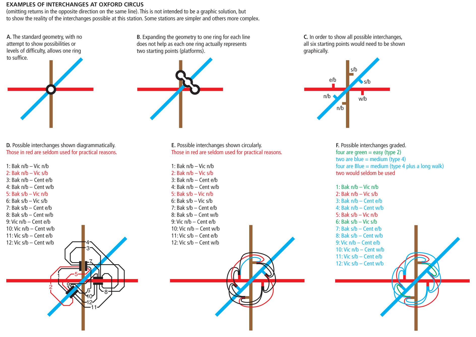
He and I then put together an illustrated report which collapsed all stations into one of nine easy/difficult grades. Readers here will appreciate that changing trains between the Piccadilly and Metropolitan Lines at stations like Rayners Lane is very easy. You get off one train, stay on the same platform and get on the next train of the other Line. At the other end of the extreme are stations like Paddington and King’s Cross, which need little explanation here.
A significant difficulty is quickly manifest by anyone who has attempted designing a straight line network diagram. Where the geometry is simple and allows it, a single interchange ring will suffice — Oxford Circus is a good example. Where parallel line interchanges occur, such as at South Kensington, a linked double ring ‘dumbbell’ has to be used; some get more complicated still, Bank being an example. This straight away invites the uninitiated to possibly infer something different is on offer at these three stations. Is the diagram ‘telling them’ something? Is this a hint at what to expect when one gets there? Is this just an unavoidable constraint of geography and geometry? Will a novice consider any of these possibilities? Does it actually matter? Will some head scratching result in tackling the journey differently? Oxford Circus has ten viable interchanges. The idea was dropped.
|
 |
| |
A page from the report (reduced in size here). At Oxford Circus there are twelve rational interchange possibilities of which two (Victoria northbound to Bakerloo southbound and vice versa) may be excluded on the practical ground that few people ought to need these — though they are both viable in the other direction, raising another level of explanation to consider. This leaves ten practical options. Which symbol would one use? Would multiple symbols be practical? |
-
service pattern and quality not shown
This request is similar to that for ‘interchanges’. The obvious one requested was for the Metropolitan Line north of Baker Street. There are different stopping patterns and some stations get more trains than others as a consequence and so ‘service quality’ is dragged into it. Again, the cost-effective answer would have been: ‘take my word for it, it will cause many complications that will outweigh any perceived benefits’. Again with Mike Horne’s subject knowledge I was able to illustrate the impracticalities, not the least of which is that other Lines had similar restrictions. All this would complicate a map which supposedly only exists to make the network look straightforward. The idea was dropped.
|
Again I ask: what is the purpose of this map? |
-
station names (all lettering) too small
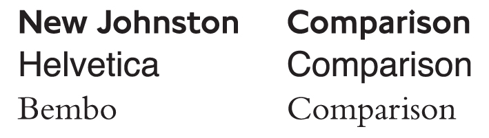
This was another naive, if well-meaning part of the brief: 12pt type to be used. The answer is a text book in itself but I’ll keep it brief.
Why 12pt? Point sizes are measured from a tiny bit above the top of the tallest characters (not always the capitals as might be supposed) to just below the deepest ‘descender’ (lower case ‘p’ being one example). Different typefaces have different proportions. If, for example, you used 12pt Bembo (I am really glossing over this) it will ‘look’ smaller than 12pt Helvetica. The disability movement has a loud voice and has decided, based on nothing I have been able to discern, that 12pt is OK and anything smaller isn’t. Hey ho, there are worse decisions made in life.
|
Three examples of 12pt lettering, all with the addition of 3pt leading. Note that the leading (vertical line spacing) on Bembo ‘looks’ greater, but it isn’t because the letters are smaller.
|
| |
I explained that using 12pt, irrespective of typeface, would make the map very much bigger — I mean a lot bigger. The response was: “make it as big as you can then”. “As big as you can to end up with a map at what size? It will need to fit your leaflet racks or you will have to change them across the entire network.” “That’s a good point.” |
-
disabled access not shown
This was very contentious. I firmly believe that all public transport should be as accessible to as many as possible and vast sums of money have been invested at many stations. What cannot be ignored is that the Underground is a hostile environment to anyone with mobility issues. OK, it might be seen as non-inclusive for mobility impaired users to have their own detailed and helpful map information and this exists. Many, I quite understand, don’t want to be treated as ‘special’, but they do have special needs and should be helped accordingly. I don’t see bespoke help as disrespectful. No doubt some will disagree with me.
Putting to one side that fewer than ten percent of blue badge holders have disabilities that result in wheelchair use, I felt that putting such a symbol on the map at each station decided relevant was not the best way to help. The truth is that these symbols are visually intrusive and complicate the map for the great majority of users. There are better options with no loss of information for those who need it.
|
The Design Process |
All design processes such as this go through to-ing and fro-ing so that all involved can have their say. Having produced several extract area samples and come through this fairly unscathed, I was given the go-ahead to design a completely new map. For economy of printing I did this to fit A3 (297x420mm), as opposed to the original and steadfastly adhered to size from 1933 (the present map area is very similar at 148x223mm). |
At the outset I said that the corporate typeface currently being used was poor in this context and also said I knew there was no point in fighting that argument, was there? There wasn’t. Edward Johnston’s superb letterforms were first used in 1916, in context, and as per the then brief, for large lettering on posters. In due course it also took a firm foothold on signs (later still on bus blinds) and did a very fine job until it was challenged from within London Transport in the late 1970s. |
The story of its succession by New Johnston, with its many failings, is not for today. That said, Johnston in its as-designed form was not good on the Underground pocket folder either, where it too had been used from the first Beck map, and before that, where it was skilfully hand lettered. It sufficed then because there was plenty of space around each name and the geometric map design allowed for this. |
Johnston’s letterforms were not designed to be made into type (hence typeface) and, when they were much later created as founts (not fonts) of woodletter and metal, certainly not for use this small. Its use set from woodletter slowly appeared in large sizes (about one-inch height capitals and larger) from 1917 and in smaller sizes in metal type from 1928. Even the metal was neither cast nor indeed needed below 36pt. Johnston’s excellent letterforms were neither designed for, nor worked at, small sizes. That said, London Transport and its predecessors made it part of its corporate image armoury, long before ‘corporate identity’ took on such a concept as thought of today. |
At the outset of designing the new map, the constraints of New Johnston bore heavily. It must be understood that all words (except ‘A’ and ‘I’), irrespective of the typeface used, are wider than they are tall. Even a short station name like ‘Oval’ is much wider than it is tall. Now consider ‘Mornington Crescent’. |
Rigid geometric maps impose considerable constraints on station name positioning. Linear triangles formed of a vertical a horizontal and a diagonal are very space inefficient when they enclose names like ‘Tottenham Court Road’ and cause significant knock-on effects on the geometry all around them. Move any one of those three surrounding lines, no matter how slightly, and everything around it has to be moved too, with further consequential effects that can affect the whole map. For this reason I have always started the design of any London Underground diagram at King’s Cross and worked outwards, as this is a highly complex area. In recent years Stratford has become equally difficult to construct well. The lengthy new Elizabeth Line station platforms connecting Farringdon with Barbican, and Moorgate with Liverpool Street, proffer possibly even greater challenges to the design of these maps. |
You might now start to get an understanding of why adding that extra new room in the middle of the TfL ‘house’ needed a re-build, which indeed it has now had — but on the same size plot of land. The house might have rooms called Thameslink or Elizabeth, but I digress. Back to 2004… |
At A3 (297x420mm) it was possible to fold the map to still fit existing leaflet racks. The new map was designed and only essential information included. Supporting information, like step-free access, was included on the back, in the station index, thus letting the map breathe. Wheelchair symbols on the map are very distracting and not relevant to the very great majority of readers. I still question how much they actual do help the people who need to know. |
Practicalities |
Taking the Victoria Line as an example in isolation, this is very easy to design for signs. All that is needed is a single vertical line, with all station names down one side, equally spaced. This imposes the least possible cognitive load on the reader. When designing a network map this is of course not possible. The new map had all stations names positioned as comfortably as possible for reading, in order. This might sound an obvious thing to do, but the present map does not achieve it. Disrupting the visual sequence leads to reading errors, which lead to journey planning errors. Significantly, no passengers will complain because they will of course not know they went wrong. |
The 2004 map was created, index compiled and typeset on the back, a few samples printed, folded and submitted to TfL for comment. A version was also produced for station platform Quad Royal (40x50 inches) posters. A week passed and I was asked to pop in to see a rather junior member of staff — in itself symptomatic of the problem. She told me the map was liked very much but could I add all of London Overground, none of which was previously on the map. “Yes, but I will have to start from scratch, again.” The reply was “Oh, can you do it in a week as we have to go to press by then?” The answer was of course not. (The May 2022 map has reportedly taken eighteen months to design, though heaven knows why.) That was the end of it, though I did ask my original client some months later why the urgency to print and the following silence on the project. I didn’t believe the answer I was given, which was that printing the map larger was too expensive. The question I was not brave enough to ask was: is it better to print millions of copies each year of a map that is known to be failing badly than to spend more on the print bill for one that actually works and serves its purpose? |
For decades the Underground map has been printed in quantities of about one million a year. I was told around 2010 that they were now printing over double that quantity. I wonder if the poorer and thinner material it is now printed on (saving money on a false economy?) causes them to fall apart quicker and thus increase the consumption rate? I do not know what the print rate is now. The retention rate might also be lower as it is of perceived lesser quality, but I am speculating. |
So the new map was still born and the existing one stumbled on. The new May 2022 map has finally supplanted the one for which I was asked to create a replacement in 2004. |
2015/17 and Procurement Tendering |
Some time in 2015 (from memory) TfL’s Procurement department tendered five ‘packages’ of mapping work. The Tube map and associated car diagrams, and Rail & Tube, the latter with copywrite jointly owned by the (now) Rail Delivery Group, was one package. I don’t know the details but the plug was pulled on this, twice, owing to (I was told) legal reasons. |
When the tender eventually emerged, for the third time, and some eighteen months after the previous contracts had expired, the package for the Tube map and Rail & Tube required a ‘revision’ sample to the existing map which was impossible without designing a completely new map overall, free of charge, to submit for the tender. I am fortunate to have been working with the Rail Delivery Group (previously the Association of Train Operating Companies) since 1984 and discovered they were unaware of the tender from TfL, despite their joint ownership. I will say no more other than the then existing supplier was retained. |
Dinner with Tim O’Toole |
For reasons nothing to do with any of this I had the honour and pleasure of being invited to dinner by Tim O’Toole in 2007, then Managing Director of London Underground. It was inevitable the map would come up in the conversation and I told him of my concerns, principally with the poor geometry and volume of low level clutter, which I call ‘visual noise’ on the map. Cognitive load is increased with the more information presented. The user is unaware of the greater effort they have to exert in subconsciously filtering out that which is not relevant to them. Tim was a complete gentleman and said nothing. |
A few weeks later I was asked to pop in to TfL about a quite different job I was doing for them and my client proudly told me he was going to get rid of all the clutter on the map. “I am even going take the River Thames off.” I suggested this was a bad idea as the river is benign clutter but does provide a sense of place to London. Off it came. The outcry in the press caused it to go back on the next printing. This is an example of the client not understanding the product and not understanding user need. |
Where are We Now in 2022? |
Well we now have a new Tube map and a revised Rail & Tube map, only now the former has had a lot more low-level information added and both have had the Elizabeth Line shoe-horned in. The Tube map is still the same size and printed on flimsy paper. The Rail & Tube map looks like a complicated snakes & ladders board with most lines zig-zagging all over the place, making many very hard to follow and increasing cognitive load notably. |
A sense of balance needs restoring. We have some easy interchanges that wrongly look a long way apart, where surely the motivation for including them is to make them look viable. We also have a map that suggests to the uninitiated that London Trams (an uninformative marketing name) extends over a greater distance than the Metropolitan from Baker Street to Amersham! |
Interchanges Abound |
How and which interchanges should be shown is a separate subject in itself. I presume boats are included because there aren’t many of them, though buses are not mentioned. Most rail/bus interchanges require little effort, though rail/boat are seldom that easy to navigate. A review needs undertaking of all possible/practical rail/rail interchanges and a serious attempt made to get the map to imply proximity or not, or not show them at all if they are impractical for the majority of travellers. The map states “under a 10-minute walk” (from platform to platform or station exit to station entrance?), which to most people is about half-a-mile and not that close. If these are to be promoted they could be made more practical. Within railway property there is dedicated signage, in the street there is not. |
The 2022 map seems to have had its content decided by minds unfamiliar with the geography and complexity of each of the stations. Dotted lines and interchange rings cannot depict this without detailed subject knowledge from the client and/or designer. Working within the constraints of technically demanding geometry, I question whether out-of-station interchanges can be portrayed consistently and meaningfully. |
 |
| |
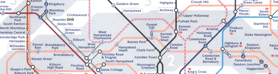
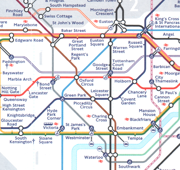
Wembley Park and Finchley Road offer the same cross-platform interchange between the Metropolitan and Jubilee Lines, though the map might imply to the unfamiliar user they are different. Gospel Oak is similar. Out in the street, all three stations at West Hampstead are close to each other, with the station buildings within easy view of one another. Finchley Road and Finchley Road & Frognal are about a 5-minute walk apart. On the other hand, Archway to Upper Holloway is about a 10-minute walk from platform to platform. To illustrate any more, and there are a great many, would be tedious. This sort of information is better not attempted in a straight line network diagram as it cannot be applied consistently or meaningfully, in the same way that interchange ease or difficulty cannot. |
| |
 |
|
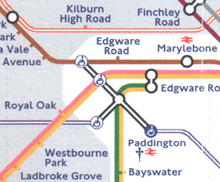
The portrayal of the interchanges at Paddington are ludicrous. Changing trains between the Bakerloo and Circle/District Lines is close and easy, as opposed to either of them and the Hammersmith & City Line, which requires at least a 7-minute walk within the overall station. The 2022 map gives quite the opposite impression. |
|
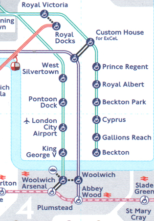 |
|
In the real world there is adjacent interchange between Docklands Light Railway and the Elizabeth Line at Custom House, whereas Plumstead and Abbey Wood stations are about 800 metres apart! |
|
 |
|
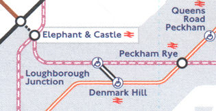
The interchange facilities at Denmark Hill and Peckham Rye are the same, but not as implied on the May 2022 map. |
|
Referring back to the 2004 request to show interchange quality, thankfully no-one to date (as far as I know) has suggested interchange ease/difficulty for overall journeys being indicated. |
Journeying south on the Metropolitan Line with Waterloo as the intended destination, there are several options. The obvious one the map suggests would be to change at Baker Street, but onto the Bakerloo or the Jubilee? The latter was intended to afford relief to that route, but either requires negotiating escalators and passageways. A practised user would change at Finchley Road, where there is cross-platform interchange. |
Consider too someone wanting to get from Waterloo to King’s Cross, what are the options the map suggests? Not especially convenient would be Northern Line to Euston and then a change to the Bank branch or the Victoria Line — not an ‘easy’ interchange. Maybe a better option would be Northern Line to Leicester Square and then the Piccadilly Line? Leicester Square requires the use of passageways, some lengthy. A perhaps less obvious route would be to head off in what the map suggests is a long way around: Bakerloo to Oxford Circus and then the Victoria Line to King’s Cross, however, Oxford Circus has cross-platform interchange and the Victoria Line provides a speedier link. |
 |
The reason I raise these examples is to show the almost infinite variety journeys people make and trying to second guess what interchange possibilities are of value is somewhat questionable. Many of the ‘walking interchanges’ are not what many people would want to do, crossing busy roads, even though the map (or more correctly the people driving the map) is recommending them. Perhaps it would be more profitable to show viable interchanges to more closely represent what will be found in the real world. |
How to Put Things Right |
There is a glib and short answer: evaluate what the purpose of the map is and start again — but it is not as simple as that. |
The ‘four Ds’ are essential and Discover and Define seem to have been abandoned long ago. Whatever the outcome they must be brought into the process. |
Discover and Define should focus on both core and special needs. Perhaps the two need separating. The desire to make the map comprehensive is actually making it incomprehensible. It is actually seriously detracting from the map’s purpose for the majority of users and calls into question if it is really fit for purpose anymore. |
Fare or Unfair Zones? |
If fare zones are deemed useful, and I think they are, they must take up the role of being supporting and subservient to the core information of the line trajectories and station sequences. |
|
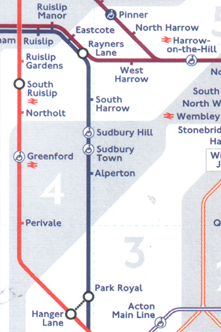
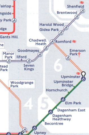
The important objective of even spacing of station names is severely compromised in these two examples. The gaping hole between Park Royal and Alperton is treated differently badly between Hanger Lane and Ruislip Gardens. To the right, when reading in a hurry, it is easy to miss Romford. These failings are all caused by the fare zones being given priority. |
| |
The notices on the map showing stations outside the zone or Oyster Pay As You Go areas are in weak grey lettering. The change of background tint from grey to greyish blue between West Drayton and Iver is almost impossible to see. Bearing in mind penalties could come into force, I would have thought these messages ought to be a lot stronger. It is also puzzling for the user to read the word ‘Special’ on the station index for those outside the zone system, or in the ‘London Trams fare zone’. What is ‘special’ about them and what is one to do differently? |
Disabled Access |
Highly contentious I know, but the symbols should be removed from the map as they are very distracting and do not always provide the level of assistance needed. The map is made further complicated where some parts of a station are accessible and others are not. The information can be made clearer by adding it to the station index, duplicating individual station entries where the access differs. The station index includes this information at the moment but not explicitly. |
Shape and Size |
The great majority of the problems with the new map are the same as for the previous one of the past two decades: it is the wrong shape and far too small. It is highly relevant to say that throughout writing this piece I had to use a magnifying glass most of the time to check the detail on the map. Surely this is an indication of a serious problem in itself. |
The unthinking use of 45-degree angles worked in 1933 and arguably still did until the addition of London Overground and Thameslink. As I implied earlier, it doesn’t any longer. Much more width is required to accommodate the now double number of station names, which, as explained, take up hugely more width than height. |
Typeface |
Corporate vanity needs putting aside. The choice of typeface should be driven by legibility and not history. Does TfL want to say ‘Look at me and my corporate typeface, no matter how inappropriate it is in this context’, or ‘We want you to use our product with as much ease as possible’. If the client wants to ‘sell’ the network, surely the latter is more important and better for TfL? Neither New Johnston nor Johnston 100 work. |
Defining the Purpose |
The genus of the Underground map was to portray what was largely a turn-up-and-go network. Adding suburban railways like Thameslink fought with this somewhat as it is not really that category of train service. |
Perhaps the Tube map should confine itself to a turn-up-and-go facility and Rail & Tube should show all railway options in the capital’s environs (both need a fundamental re-design). As we know, it isn’t that simple. Some sections of the Metropolitan are not turn-up-and-go, though they are part of the Underground — so let’s exercise a bit of sense and just include it and be done with it. Maps are for ‘where’ and timetables are for ‘when’. Trouble usually follows if a map tries to do the job of a timetable. Perhaps the arbiter of what to include is: do I need to consult a timetable before travelling? Even answering that is not straightforward. |
A good map/diagram can only portray what is actually on offer from the product. If the product is complicated the map will be as well. Maxwell Roberts has said more than once “Don’t blame a bad map for a bad network”. |
What about simplifying it? Successful simplification requires a lot of subject knowledge and judgement. A big problem I believe is that the map is marketing led, with the tendency for it to tell everyone everything. I fundamentally believe that marketing and information are different concepts but are routinely lumped into one. It doesn’t work. I could make some quite pointed observations about marketing but libel laws are for the rich, and I am not. Information provision requires a different mindset. |
Another huge failing of these maps caused by marketing attitudes, is the alacrity with which they get filled with low-level supporting information. These mount up and submerge the important high-level information in a mire of visual noise. Every now and then the maps get so burdened that a ‘clean up’ is ordered. Off comes all the clutter leaving that all important ‘air’ that lets any map breathe. Give it a short while and the salivating starts for what can be added into all that space. It just goes round in circles. No corporate memory. In May 2022 we are at the farthest part of the cycle. I wonder when the next 2007 conversation will happen with someone who has the clout and understands. |
It is essential that the client understands that these communication tools are very difficult to design well. The only easy thing about them is to think their design is easy. The client has to be made to realise they are out of their depth with all this and give the job to a supplier that does understand. The present incumbent probably has no more subject or product knowledge than the client, and the present map evidences that neither really understands the user requirement either. I fear for the mayor’s probable Dunning-Kruger thinking too, that the map is an unchallengeable ‘icon of London’. If ‘Every Journey Matters’ as per the slogan, then why not make those journeys easier to plan? Any thought of abandoning this sacred cow in its current form would end up with the perpetrator of such a suggestion having ravens for company. But it can be retained, it just needs designing properly to be fit for purpose. |
I got caught up in a recent flurry of e-mail exchanges among some intelligent commentators on the merits of Thameslink being shown better on the map. To quote one message to me (the source of which to remain anonymous) “I do wonder whether part of the problem is that design is left to a design department. This correspondence has emphasised how good design was in the 1930s when good design was championed by the chief executive who understood what it was for.” |
There is much more to be said on all this but I will finish by saying that this is not a personal crusade, but I do actually care about TfL’s ‘house’, but it needs bigger grounds, and a good architect. |
Fulfilling the Purpose? |
Motivated by all this, click here for the map I have designed to remove many of the problems with the May 2022 Tube map and to incorporate the criteria I believe matter: |
- 30-degree diagonals used from the horizontal to allow space for station names;
- wider map with a larger and more legible typeface, not in blue and not bold;
- zig-zagging reduced to a minimum: (Thameslink reduced from 51 kinks to 34 and Overground reduced from 50 to 31);
- station proximities depicted meaningfully wherever possible;
- interchanges depicted for more meaningful navigation on site;
- step-free access removed and details amplified in the station index;
- fare zones subdued and not interfering with optimum station name placement;
- fare zone number less obtrusive (smaller) but shown more frequently for clarity;
- river services removed from the map and given their own space;
- larger paper size still folds to the same size as the existing TfL map.
|
| |
| |
| * * * |
|
| |