 |
| It is not my intention to try and cram hundreds of years of history and learning about letterforms into a short piece of writing such as this. The presentation of this piece, here on a website, makes it all but impossible to illustrate meaningfully, as I have insufficient control over what you are actually seeing on your computer monitor. Furthermore, reading on a screen presents very different demands on us than reading from paper. |
| Over the past 300 years, many books have been written on the science and psychology of reading and the subliminal interpretation of letterforms. The successful design of a typeface is the ultimate graphic design contradiction. Each of the individual characters must conform to an overall ‘family feel’, with each having visually similar stroke thicknesses and general proportions, whilst, paradoxically, each must be instantly recognisably different. A well designed typeface is akin to a good sports referee — it should go unnoticed. |
| It is because we learn to read at an early age and usually don’t give the mechanics of reading a second thought, that poor typography, and the use of an inappropriate typeface (even a good one) for a particular job, is often dismissed. The human brain is amazingly good at making the best of a bad job when reading letterforms. However, I am sure everyone has experienced the phenomena of reading the same line twice, or losing one’s way — this is almost always because of poor typography. Poor typefaces, or good ones used in the wrong context, usually cause reading fatigue and the reader to stop reading sooner than they otherwise would have done. |
| Reading fatigue does not usually set in in a few minutes (though it can in particularly bad circumstances). That said, some aspects of legibility are a bit surprising at first and may be hard to appreciate. |
| I would like to express some personal opinions (not entirely confined to me I might add) about the accolades afforded to Helvetica. I once heard someone compare Helvetica to hamburgers. It went something like: ‘Helvetica is the hamburger of typography — it will do in most circumstances, but it is seldom what you really want’. |
| There are numerous facets to getting typography right — too many to go into here, via a medium quite unsuited to demonstrating them. A few can be covered though and show why I dislike Helvetica so much. |
| Every era has its fashions and those of type design are no different. The advent of computers has caused this to run amok. (We don’t need any more typefaces. Honestly.) Probably the two best known, and over-used, typefaces of the 20th century are Gill Sans and Times Roman. Both were designed for a particular purpose and both enjoyed huge and justified success. Both were (and still are) inappropriately used, sometimes hopelessly so. Gill started to be used in 1928 and Times New Roman a little later in 1932. So we have had two ubiquitous typefaces, one sans serif and one seriffed, for about 80 years. |
| The late 1950s saw the first variants of Helvetica appear and within ten years it had almost completely usurped Gill as the sans serif typeface of choice. It also became indiscriminately used where a seriffed face would have been a much better option. It is used for signs (where with care it can be forced to do a job). Where I have real problems with it is in its use for continuous text. Again, it can be made to be less objectionable than it otherwise might, but only in skilled hands, to overcome its inherent failings — the weights (stroke widths) are too heavy and the ‘x-height’ (the height of the lower case letters, like an ‘x’) is too great. |
| These two aspects make it hard to work with. The over-size ‘x-height’ can to an extent be overcome by greater leading (line spacing) than would otherwise be required. Space is crucial to readability: between letter pairs within words, between the words themselves, and between consecutive lines. It is the even visual spacing between letter pairs within words, as well as the words and lines, that gives the focus to the letterforms themselves. This can be hard to accept but is undeniable. |
| Helvetica’s over-heavy stroke thickness is impossible to overcome though and why, in my view, it is a typeface not worth fighting with. Paradoxically, it can be made to work — where a level of illegibility is actually a useful thing. |
| We generally think of typesetting as being text where words follow in a continuous stream — as in reading continuous narrative text, such as this. Of course any situation where we read words (other than hand-writing) as single entities or very short groups, are commonplace too. The most obvious examples are signs or headlines (which are also signs really), but can also be used as lists, as in a series of stopping points in a timetable. Helvetica can work in these circumstances, capitalizing on its slight illegibility and so slowing reading down. It makes you pay more attention (though you won’t realize it), though I doubt that was in the mind of the original designers. |
| Contrariwise, that inherent illegibility, as single words or small groups of numerals, can be just what you don’t want. A case in point is route numbers on the fronts of buses. In this situation a passenger may have to make a rapid decision whether to board or not and it is quite important to read the bus number quickly — and correctly. |
| And Helvetica has other failings too. I often hear commentators praise it for its clarity of form. For heaven’s sake, all sans serif typefaces must be clear in form — they have much simpler letter shapes than any seriffed face. That’s the whole point of them. (Actually this is not always a good thing, but that’s another story.) |
| |
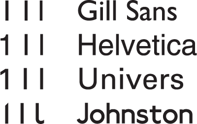 |
An example of how hard it can be to distinguish, at reading speed, some individual characters in sans serif typefaces. I would argue that only one of these four makes it obvious which each of the three characters is, either within a word, or as a separate character. Furthermore, the ‘hockey stick’ lower case ‘l’ is not just a quirk, it actually makes spacing of the following character much easier and stops it being too close. |
| |
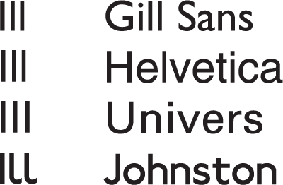 |
Out of reading context admittedly: nevertheless it is not hard to read this word with ease in one of these typefaces. |
| |
| Designers of sans serif typefaces have to be extraordinarily careful. I refer back to the start of this piece. Designing a typeface is the ultimate contradiction in making each character have a similar look, but also each one has to be obviously different. This is where Helvetica goes into deeper trouble. Many of the characters are too similar and easy to confuse — they are not obviously different. Never assess a typeface as a collection of individual characters. No-one reads anything that way. The whole point is that we read them as groups of characters — words. |
| The weights (thickness of strokes) is a problem too. There is of course no such thing as a ‘correct’ thickness — there are too many variables. That said, ‘medium’ should be medium and look like the middle thickness. From there the designer can go lighter and heavier. The starting point with Helvetica is a bit too thick (about halfway between normal medium and bold) and so the ‘light’ looks like most other typefaces’ medium. The obvious trouble with that it that bold is too bold and even more difficult to read. The ‘counters’ the holes contained within, for example, an ‘o’ or an ‘d’, become too small. |
| As if all this wasn’t enough, it goes even more wrong with the way the various weights and styles are named and hang together as a true family, because this is exactly what it is not. This stems from there being no plan at the outset. It is a bit of a rag-bag where different designers have created different styles and weights and named them in their own way. So we have Helvetica Roman (a bit of a nonsense name in itself), Helvetica Medium, Helvetica Regular, Helvetica 55, oh and yes, just plain old Helvetica. All of these are in reality, medium (and all too heavy). Then add all the variants of light, bold, light italic, medium italic, bold italic and you start to get a feel for why even practiced users don’t know where they are with it all. The condensed (narrower) versions have been added by yet more designers and are even less successful. Condensed faces make even more demands on legibility and the starting point was not great in the first place. The numerous varieties have been created over several decades and have little structure. |
| I am led to believe that others with a far greater understanding and experience than I do share my view. Whilst I have not researched it, and only have second-hand facts to go by, Helvetica Neue arrived in 1983 in an attempt to sort this muddle out. According to one commentator: |
| ‘Neue Helvetica was redesigned and digitised in 1983 by D.Stempel AG typeface as a self-contained font family. Today, this family consists of 51 different font weights. |
| Helvetica had grown in popularity throughout the 1960s and 1970s, and more versions of the family were introduced. This led to vast confusion: the same weight is often referred to by two different names, design features often vary from one face to another, and so on. Differences in alignment were corrected, subtle features were made consistent from one face to another, and all the weights and widths were designed to work together as one family. This led to the development of Neue Helvetica (German for New Helvetica).’ |
| Ok. So it’s all a bit of a muddle and Helvetica Neue (as almost everyone calls it other than its creators) certainly has resolved a lot of the confusion. Sadly, it has also introduced some of its own, in terms of the numbering system used to identify each variant. However, this has got nothing to do with the fact that it is still fundamentally flawed in the proportions and shapes of each character. The real pity is that it is still so popular. |
| The saving grace is that fashions come and go. While Gill reigned supreme for decades and is still widely used, it is not encountered anywhere near as frequently now as it used to be. Many other sans serif typefaces came along to contest Gill’s supremacy — Futura (1928), Kabel (1927), there are loads. A little later (1957) Univers came along and it is a true triumph of type design and planning by Adrian Frutiger, followed a few years later by the more elegant, but slightly less versatile Frutiger. So, when will fashion swing us away from Helvetica? Well, in the last decade it has begun to happen. We now have Ariel and this mimic of Helvetica has somehow managed to make things even worse. It is truly horrible. Its saving grace is that there are almost no variants to make it of any use whatsoever in most circumstances. |
| Gill in itself has very powerful roots in the earlier and far better proportioned Johnston typeface, commissioned privately by the London Underground, and used in its earliest forms for signs and posters from 1916. |
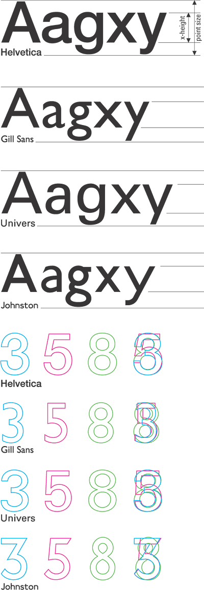
| When comparing these various typefaces, it starts to make sense why we readily (but subliminally) read some more easily than others. In the examples below, note how Helvetica (in its Medium form as are the other examples) is too heavy and its x-height is too great. These two facets make continuous reading that bit more difficult, because the letterforms are firstly, too similar, and secondly, too heavy. (Transport for London’s ‘New Johnston’ suffers from precisely the same problem and violates the carefully calculated design proportions of Edward Johnston’s original.) Both reduce legibility, especially at smaller sizes. It is for these reasons that Helvetica works more successfully when continuous text is not required for example: as a list of station names in a timetable, or as large format signs. In fact, all of these sans serif faces are unsuitable for continuous text and all of the others work better for signs than Helvetica. |
To help see the similarities of these letterforms, these three figures have been individually coloured. Where they are overlaid, it can be seen that the lower halves of the Helvetica characters are far too similar; though the Johnston ‘3’ and ‘5’ are very similar in the lower half, they are very different in the upper. Have a close look at these. |
| |
 |
| * * * |
| Some recommended further reading: |
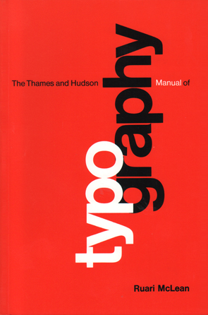 The Thames & Hudson Manual of Typography The Thames & Hudson Manual of Typography
by Rauri McLean, 1980 (and later)
Anyone with an open mind to the fact they may not be getting the best from their font menu will move their skill level upwards by reading this. The work was published three decades ago and has had new editions to take later technology into account.
The real benefits to be gained though are to do with understanding the principles of typeface choice, layout design, choice of paper, and so on. The historical material explains the centuries of learning and progression of aiding us all to read with minimal effort. In an age that now allows all of us to ‘handle type’, we should all at least acknowledge the importance of presenting the results well. The shape of the page matters immensely, margin dimensions matter too; so do the choice of a suitable typeface for each job, the point size it is set to, the amount of leading (and more). Those who dismiss this are losing out more than they can possibly realize. |
| * * * |
 Johnstons Underground Type Johnstons Underground Type
by Justin Howes, 2000
Edward Johnston was not a type designer, he was a calligrapher. However, having been commissioned by London Underground’s predecessor, he designed the exquisite and deceptively simple looking, letterforms that bears his name. First used in 1916, designed for signs and posters and not to be used smaller than 36pt, it became commonly used out of context in its later years. It was replaced in the early 1980s for all the wrong reasons by New Johnston, inferior in every respect.
There are insufficient knowledgable commentators on Johnston’s massive contribution to the lives of all Londoners. Fortunately, Justin Howes was one. |
| |
| * * * |
 An Alphabet for the Underground: An Alphabet for the Underground:
The Work and Legacy of Edward Johnston
by Mike Horne, 2022
Since its commission by the Underground Group in 1913 and early use from 1916, master calligrapher Edward Johnston’s magnificent letterforms had gone largely unrecognised by history and the design world. In recent decades this has changed notably — though sadly quite a lot of nonsense and myth has been added at the same time. In 1977 a blue plaque was unveiled in Hammersmith, London, and a more elaborate tribute at Farringdon station, also in London, in 2019. You can learn more about these two important events here.
A new book was published in 2022 called An Alphabet for the Underground: The Work and Legacy of Edward Johnston. This was the final work by leading historian Mike Horne, who we lost on 26th March 2020. It is published by Capital Transport and covers the development of Johnston’s fine letterforms from inception and uses by graphic artists, signwriters and typefounders, through to its design for modern electronic applications. The book is the result of much new research and explains the practicalities of lettering and typesetting, putting the hype to one side. Anyone with a genuine interest in the subject has to have a copy of this important book. |
| |
| |
| |
 |