 |
| In order to understand verbal instructions, first one must learn language and the rules of grammar. |
| In order to understand written instructions, first one must learn verbal language, then the alphabet, spelling and punctuation. |
| In order to understand graphic instructions, first one must get into the head of the person who designed them. |
| Writing is not an easy means of communicating with readers. The presence of the wide array of aural nuances, inflections and subtleties that face-to-face communication brings, supported and augmented by visual body language, are all missing from the written word. This is why spelling, punctuation and grammar are all important. |
| The shapes of letters, numerals and punctuation marks are in truth simply graphic symbols we have to learn to recognise at an instant and educate our brains to subliminally convert into mental sounds. Having learnt language, spelling, grammar and punctuation, everyone (in theory) has the same chances of success when reading written instructions, of any sort and on any subject. |
| The starting point of general understanding of written language ought to be the same for anyone with a basic ability to read words. We all know what a letter ‘a’ and a full stop look like; crucially though, we all know what they mean. Metaphorically speaking, the writer is on one bank and the reader the other; the written word provides the bridge that joins the two. There is no need for the writer to sit alongside the reader and explain every word of what he has written. |
| However, communication by graphics takes matters to a different level altogether. The reader has no experience of the graphic artist’s ‘language’ to call upon. He has no idea what the visual symbols (the words and punctuation equivalent of written language) look like, nor what they stand for. The reader has effectively got to interpret a language he has not read before. It is a like reading a book written in a foreign language — one that has not been learnt at all. The reader may recognise the letter shapes, but will not understand the words they form. |
 |
The problem here is that whereas there is an agreed symbol system for written communication via words, taught from an early age, there is no agreed system for pictorial communication, the user just has to pick this up on an ad hoc basis. There are very few exceptions: roadsigns (the Highway Code) and Chinese pictograms being a couple of examples. The difference here is that teaching and learning of these is institutionalized, but this is not so for everything else. In the illustrations above, without having been taught, how would any road user know that the red sign was telling him he must not go faster (and miles per hour is not even portrayed at all) whereas the blue one instructs the very opposite. How would anyone know what the black sign dictates? Violating any of these graphic instructions could have serious consequences. |
| |
 |
| In the two road sign examples above, no matter how long the user puzzles over their (implied) meaning, the answer will not be found without the learning process that takes many months, having come beforehand. Statistically speaking, the observer of these two signs has a zero percent chance of interpreting (guessing?) that the one on the left means: beware, trams; whereas the one to the right is saying: route to be used by trams only. These may be subtle differences, but they are nevertheless important ones. UK road signs have a hierarchy of meaning: red triangles are warning signs; blue disks are informing. Failing to learn this will result in failing the driving test. |
(Where the graphic ‘information design’ is not necessarily life threatening, the designer can (and usually does) get away with less than ideal, or worse, outcomes.) |
| |
 |
| Sheet music is another example of a system of graphic symbols that are completely meaningless to anyone who has not been taught what they mean. What key is this piece written in? What is the time signature? Can you read the tune? Most musicians know the answers, but we would not expect anyone else to. The nub of this is that the symbols do not relate to anything we experience in our normal lives. No graphic communication can work without this crucial tangibility, yet so much day-to-day information design fails on this fundamental principle. |
| |
| |
 |
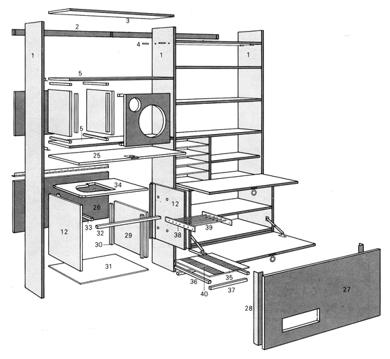
| The great majority of graphic communication has to be interpreted by the user, using little more than intuition. Diagrams instructing how to assemble a cupboard rely on the reader recognising the drawings of the screws, nuts and bolts etc as being just that. It is also anticipated (by the designer) that the reader will understand that the oblong (3D) shapes are planks of wood. None of this is explained. Even with the accompanying written instructions, it can be a struggle to comprehend. |
| |
In the ‘blow up’ drawing, below, of how to assemble a cabinet, life is made easier for the reader as he is able to relate the shapes in the drawings as being recognisably the same as those of the objects in front of him. This will not work in intangible situations, such as reading a map. |
 |
| The designer of a graphic communication (information design) has to concentrate very clearly on his own thought processes. This is a difficult job. It is made more difficult by the fact that there is usually just one designer and an infinite number of potential readers, the latter of which all have different levels of cognitive and interpretative skills. In common with written communicators though, the designer too will not be present to help the reader. The reader is on his own. |
| Information designers have to work very hard to create a range of symbols (and all graphic communication is a collective of symbols — lines, blobs, colours, shapes) which are unambiguous. The designer has to anticipate what his audience is likely to think and what action they might take when they look at his work. Paradoxically, the reader has had to do precisely the opposite and get into the head of the designer. |
| It is commonplace for designers to fail, simply because they are unable to put themselves in the position of the reader. The designer may understand his subject, and that which he is trying to communicate graphically, extremely well (though this is often not the case, and compounds the failure of the inevitable outcome) but this is still a distant dream of successfully getting the message across to someone unfamiliar with the subject. It is essential that the designer gets ‘into the head of the user’, so that likely (mis)interpretations are known and can be avoided. In this case, strong subject knowledge can be an impediment. |
| A good friend said to me many years ago: “Doug, the only thing one should assume, is an air of intelligence, on occasions”. A little whimsical perhaps, but don’t dismiss it. Successful information design depends on many things: a significant understanding of the subject being communicated is mandatory; the ability to stand back then and convey it as if the reader knows nothing, is very hard. When we speak to anyone, there is always a massive amount of assumption going on. Most obviously, one assumes the person listening understands the same language. When we meet someone for the first time, we tend to speak with more caution and feel our way, trying to establish at what level the common ground exists. This can take time. |
| An information designer seldom has an opportunity to establish with his audience where this common ground actually is. It is of course impossible because there is only one designer and an infinite number of readers, all of whom possess different interpretative abilities. There is therefore an infinite number of different common grounds; many more readers will share no common ground at all with the designer, or the product. (Technically, there might be an infinite number of possible grounds, but in practice the same errors crop up time and time again and a good designer, with strong subject knowledge, should be capable of coping with these.) |
| Many designs fail to communicate successfully even when the designer enjoys a solid understanding of that which he is communicating graphically. It should not be assumed that all one needs is a sound understanding of the product. In some ways, having a sound understanding as a starting point can make it more difficult, because the assumption level can be too high. One thing is for sure — a poor grasp of the subject being communicated is guaranteed to result in a poor design as it will probably suffer from factual errors, even if the design is beautiful to look at. |
| I get very frustrated when people assess an item of information design and say: “It looks very nice”. Though an important part of the initial communicative process, it is not the fundamental one. Let's hope the design works too — otherwise, what was the point? |
| Maps are a perfect example of the importance of good information design. They are functional items. They are not like a swanky label on a newly launched bottle of expensive perfume. The latter has to be attractive, in the true sense of the word, and information design must be attractive too, in order to capture the readers’ attention in the first place. However, the primary function of any map is to help the user to plan or find his way. Producing one that achieves this is no mean feat and it is routinely under-estimated how complex a task it actually is — when done well. Maps can fail in two basic ways: they can of course simply be inaccurate and the outcome becomes obvious, but often only when used; they can also fail when the factual content is sound, but presented poorly. Everything on a map is symbolic and all facts are conveyed by implication alone. Maps are not like written instructions. |
| There is a fundamental dilemma in designing a graphic information system. Too much detail invites the response: ‘it is too complicated; I can’t understand it; I am overwhelmed and don’t trust myself to get the right answer’. On the other hand, the oft-sought elixir of a ‘simplified’ approach often leads to the user getting the wrong, or less than optimum, answer, because the content is just plain inadequate. |
| Finding the right balance, whatever that might be, is impossible, if one tries to satisfy everyone. Forget it, it is not going to work. Whatever product is the outcome, we still have to entrust it to the vagaries of human diversity of mind and intelligence, for each individual to make what they will of it. |
| Facts must be faced: if the product is a network of bus and/or railway services that is comprehensive and extensive, then we must not fall into the trap of blaming the information system when some people fail to grasp what is on offer. Put more simply: don't blame a map for being too complicated when it is the network that is complicated. |
| Simplifying it (leaving bits out and glossing over the awkward services and geography) may well result in a map that indeed ‘looks’ simpler, but what has been achieved? This is analogous to taking a scientific work, such as exposition on gravitational attraction, and reducing it to a few pages of layman’s text. This may be more engaging to the target audience but someone actually wanting (no, needing) the full facts so as to make a meaningful interpretation, will have no chance. |
| The starting point from any graphic communication system must be a close study and understanding of that which it is desired to communicate. Unfortunately most such strategies don’t deal with detail, when it is just that which should be the starting point. One has to know the end product in detail in order to know what it is one is planning to create. So, start and the end and work backwards to establish the strategy. |
| It is my opinion that matters can get worse still. It is now usual in many industries for information to be entrusted to the marketing department. They may not always be called ‘the marketing department’ but this is what they are. ‘Advertising’, ‘marketing’ and ‘sales’ are not the same thing, though the three concepts are often treated as one. Furthermore, ‘information’ comes sufficiently dangerously close to these concepts for it to be lumped into the same pot. |
| Management at the client end has got itself into other difficulties in recent decades owing to the rise in the amazing versatility of computing hardware and software. Computers must be one of man’s most incredible inventions in that this single tool is capable of doing such a huge variety of jobs. Few of us can live without them today. |
| The spectacular rise in electronic technology has made everyone a designer, or, more pointedly, has delivered expert tools widely into the hands of inexperts. Computers have undoubtedly brought huge benefits; as in several other professions however, respected skills, experience and quality have given way to quantity, cheapness and indifferent results in many cases. This of course does not mean there were no bad designs and/or maps before computers — far from it. However, there can be very few people who have never looked at a map, though up to the late 1980s the ability to draw one was confined to a much smaller number. This is equally so in all other aspects of information design. |
| Typography too has suffered immensely in recent times for the same reasons. The world is now full of people who know how to change the typeface, they know how to change the point size and leading (though I doubt many know what these expressions mean); they know how to change the colour; they know how to make it bold, italic or whatever. Sadly few actually know the ‘when to’ and the ‘why’. Poor typographic layout is almost expected now, with readers never knowing, or even realizing, why they got fatigued when reading, or why they kept reading the same line twice, or mis-read a word. They also think that it was their fault they went to the wrong platform or didn't chose the best route and changed trains at the wrong station. |
| Actually, they were probably blissfully unaware that any of this had happened at all and herein lies the real problem. Those who commission information design often operate under a false premise — and a crucially important one that can wreck their assessment of the level of success of their commission. The crux of this is they believe all is well with the design, and it’s doing a fine job, because ‘we haven’t had any complaints’. |
| Of course they haven’t. As a percentage of those who feel aggrieved, how many write to complain? Contrariwise, how many of those who are happy, write to say so? Yes, more people are motivated to complain than to praise. Quite rightly so. If something has been provided to assist, and it works, then all that has happened is that the user got what he should have got. No need to award prizes. If we go to the shop to buy a loaf of bread and they sell us one, there is no need to praise them for stocking bread. That’s what they do. |
| The reality is that very few people are moved to complain, even when it might be justified. The truth though is that interpreting graphic communication is such a personal thing, that most people have no idea whether they made the best of it or not. People frequently stick to the same tried and tested journeys when there are better options. They simply have not worked out the better option, because they have no need to in their own minds, because what they repeatedly do does get them a result. |
| The sad thing is that, quite possibly, many people could make better decisions, with better outcomes, if they interpreted better designs. I believe it is the duty of those providing graphic and written instructions to provide the best quality achieveable. The fact that the commissioner of the design ‘cannot see anything wrong with it’ does not mean that it is good. Often the designer can see problems the client may be insensitive to. There is a huge amount of psychology involved in good design and understanding the cognitive processes of the end user is a critical part of the skill and training of the designer. The commissioner should not need to have any more than a superficial opinion, otherwise, why commission work from the designer. Why does he not do the design work himself? |
| A probable explanation is that, with the problem solved (by the completed design) the solution looks simple. They think: ‘I could have done that’. No they couldn’t, otherwise, they would have done. Why didn’t they? What we don’t need is the opinions and decision making of people either unqualified to voice them or make them, or those insufficiently experienced to do so. Committees don’t help either. Someone once said that the trouble with democracy is that it take ages to reach a decision — and then when they do, someone changes their mind. |
| There has always been a level of willingness to spend time and money on market research, to find out if this works better than that. However, corporations are often reluctant to spend time and effort on actually making products better, presumably because the outcome of the evaluation process was seen as unclear. It is very difficult to measure the success or failure of information design products. The audience may not perceive any improvement in the quality of what they see and use, in fact it is highly unlikely they will. We should not expect the user to think ‘ah, that was easier to follow’ (assuming the ‘thought’ was perceptional as opposed to subliminal) and certainly we should not expect them to write and tell us. |
| As previously noted, graphic instructions are almost always complex by their very nature and we ought to trust those who have an understanding of the processes to get the designs right (or as right as they can be, depending on the product) so the audience gets the best from it — though most of them will almost certainly never realize it. |
| The attitude: ‘I can go for the cheap option as the users don’t complain about the quality’ is missing the point. The accountants’ balance sheet can reveal the savings made on the lower spend. The balance sheet cannot however show the lost income from lesser take-up. Furthermore, it is not possible to asses the effect of poor, or wrong, decision making, in the case of a passenger using public transport, which subliminally lowers the travelling experience (often considerably) and reduces future take-up, or indeed removes it altogether. |
| It should not be supposed that the use of public transport is always the preferred option. It has been said, somewhat sardonically, that many people’s modal choice is between taking the family saloon or the off-roader. Public transport is far more often a means to an end rather than a means in itself. Therefore, in order to attract users (the margins between profit and loss are usually within this band of opportunity) the product must be more desirable. Desirability has many strands and different people have different priorities. Raising the profile of the whole travelling experience has no absolutes and trying to establish them is futile. |
| As with many aspects of life, many things inter-relate and paying significant attention to one or two aspects and ignoring or undervaluing others will not be very effective. How cost-effective is a fleet of new vehicles, at great expense, when the users don't have a clear understanding of where they go, or when? |
| What value a new bus station, with planning, architect and construction costs calculated in millions, served by buses with a unit cost of tens of thousands, to be let down at the point of delivery by poorly designed passenger information, or well designed passenger information not placed on the line of sight? |
| What value a six-figure sum spent on new branding, corporate identities and colour schemes, when applied to passenger information where the identity takes priority over the factual accuracy of the content? What was the eventual payback of the publicity which cost a few hundred pounds less but worked less effectively? How many future journeys were lost as a result of the lower travelling experience? |
| An information designer’s job (and there are plenty of bad ones too for reasons stated above) is to take the decision making process away from his client and deliver successful results back to him. That’s what he is being paid for. Though there are some no doubt, few of us go to the doctor and not only tell him our symptoms, then our diagnosis and also which medicine we require to cure the problem. I once heard a transport consultant I much respect say: ‘tell me your problem, not your solution’. This may not be what the client wanted to hear but he was not being paid to be popular — he was being paid to be right. |
| Because everyone has a PC or Macintosh on their desk, it doesn’t make them a good designer or writer. Give most people a fine set of woodworking tools and they would probably not think they can start making furniture or carve a table leg. Stick a Gibson guitar in most people’s hands and they would do well to tune it up, let alone play like Les Paul, Jan Akkerman or Jeff Beck. (The tune-a-day books don’t work either with the talent and understanding missing.) |
| The trouble is, everyone is aiming to get the maximum out of modern technology, with the minimum amount of effort in the shortest amount of time. Young people are being trained accordingly and therefore will only produce a default level of quality based on the minimum amount of skill needed to use the software. In truth, skill is the product of time and effort — if you reduce these factors, skill is weakened and as a result quality becomes set to a lower standard. Expert tools don’t bring expertise and experience with them. |
| * * * |
| Some recommended further reading: |
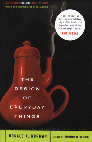 The Design of Everyday Things The Design of Everyday Things
by Donald A. Norman, 1988 (and later)
This was originally published with the title ‘The Psychology of Everyday Things’ and this was said to put some people off, perhaps being too ‘deep’ for us mere mortals. Not so. I found myself applauding several times when reading this insightful book. I had already written my piece above and realized Mr. Norman had got there way before me. There is a whole section devoted to doors — you wouldn’t think there was so much scope for putting poor and misleading signs on such a commonplace structure. |
| * * * |
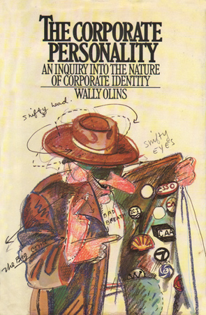 The Corporate Personality: The Corporate Personality:
An Enquiry into the Nature of Corporate Identity
by Wally Olins, 1978
Wally Olins is a much-respected designer and has been involved in several major international projects. When I was made aware of this book I was told ‘it will change your life’. A bit over the top perhaps but I have lost count of the number of people I have told ‘you must read this’ — including some of my own clients.
The author rightly labours the point that corporate identity and corporate personality are entwined but quite different entities. Written over 30 years ago, and with some obvious technological design and production methods being quite different now, the thrust of mankind’s input clearly are not. We still make the same mistakes over and over again, worrying ourselves silly over the precise (whatever that means) application of corporate colours and typefaces and then paying scant attention to the crucial part — implementation of the products for their intended purpose. Committees meet, sometimes for several years, interrogating the designer to get just what they (think they) want. Satisfied with the inevitable compromises, the project is handed over to a lower ranking group of people to make it all happen.
The implementation group often has had little involvement in the design process, and equally insufficient sensitivity to it. So the new products and posters are exactly the right colour (until they fade quickly owing to the procurement process having appointed the cheapest supplier). Posters are then put into poster cases that aren’t quite the right size and often then not positioned to their best advantage. (I must write a piece about poster cases; you wouldn’t believe how much there is to get wrong — and routinely is.)
I read this book about 24 years after its publication and realized that much of our industry continues to bang its head against the wall. |
| * * * |
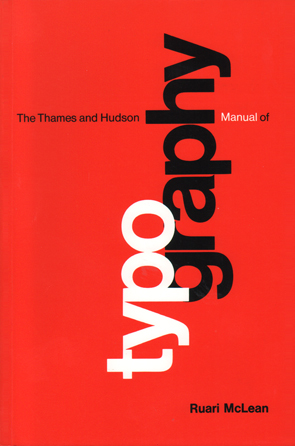 The Thames & Hudson Manual of Typography The Thames & Hudson Manual of Typography
by Rauri McLean, 1980 (and later)
Anyone with an open mind to the fact they may not be getting the best from their font menu will move their skill level upwards by reading this. The work was published three decades ago and has had new editions to take later technology into account.
The real benefits to be gained though are to do with understanding the principles of typeface choice, layout design, choice of paper, and so on. The historical material explains the centuries of learning and progression of aiding us all to read with minimal effort. In an age that now allows all of us to ‘handle type’, we should all at least acknowledge the importance of presenting the results well. The shape of the page matters immensely, margin dimensions matter too; so do the choice of a suitable typeface for each job, the point size it is set to, the amount of leading (and more). Those who dismiss this are losing out more than they can possibly realize. |
| * * * |
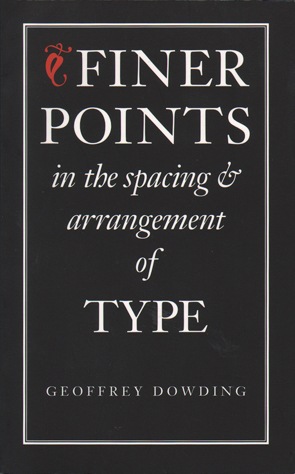 Finer Points in the Spacing & Arrangement of Type Finer Points in the Spacing & Arrangement of Type
by Geoffrey Dowding, 1955 (and later)
This little book takes typesetting into the realm of genuine professionals (and not just users of computer programmes whose marketing departments have put the words ‘pro’ or ‘professional’ in their title).
If, like me, you are fascinated by type, you will find there is always so much more to learn and so much more to be gained by tapping into the experience of others who know what they are talking about. No-one has to accept everything professors and experts have to say, but we should always listen and make our own decisions — but based on know-how and not ignorance. The author extols the virtues of tight letter spacing and, for me, this book is set a little too tight — but read it and decide for yourself. |
| * * * |
 Hy-phen-ation Hy-phen-ation
by Ronald McIntosh 1990
Some may be surprised that there is a book which only discusses one punctuation mark. However, this is not the only work on the humble hyphen and it is a pity that it does not get more attention judging by some of the terrible hyphenation one now sees.
I have a specialist book on my shelves which is about just one typeface. It had a cover price of £200 (yes) and is wrecked by indifferent typesetting. How this limited edition large format publication made it to press with two words unforgivably so badly hyphenated defies belief. Even the most inexperienced person must surely avoid the-ory and leg-end.
Read this little book, learn how to avoid bad hyphenation, put it into practice, and we will all have made the world a slightly better place. |
| * * * |
|
 |