 |
| Maps have a special place in human life. It has been said that they are the second most frequently searched for item on the Internet. They exist first and foremost to provide the function for journey planning, but also provide the reassurance and support when the journey is being made. Furthermore, and beyond this, for some of us maps provide an endless source of pleasure as artefacts in their own right. It is however unfortunate that so many commentators have written about them with such passion, but sadly overlooking what they are actually for. There is of course nothing wrong in enjoying the purely visual appeal of a map, though so much is being lost when the context is ignored. |
| The primary function of any map is to help the user to find his way. Producing one that achieves this is no mean feat and it is routinely under-estimated how complex a task it actually is – when done well. Maps can fail in two basic ways: they can of course simply be inaccurate and the outcome becomes obvious when used; they can also fail when the factual content is sound, but presented poorly. A good draughtsman is able to put himself in the position of the user. When his map is used, he will not be at hand to explain a particular feature – the reader is on his own. Everything on a map is symbolic and all facts are conveyed by implication alone. Maps are not like written instructions. |
| History is littered with inventors, composers and artists who die almost unrecognised by society. Add a few decades and things can change. Enlightenment is all well and good, but without a ‘champion’ to the cause, the status quo remains. However, when the champion comes along, the deceased can achieve mythical status. In some cases this is a good thing (I love Mahler and Stravinsky – both widely hated in their own time). |
| The loudness of a champion’s voice is vital to critical mass being reached and appreciation of the past works igniting. The champion may be truly enlightened with broadcasting skills to match. The danger is that he may get carried away on the ever enlarging cloud he has built and on which he is floating. The media latch on and (in their own inimitable style) don’t let the facts get in the way of a good story. It is far less effort to trot out the thoughts and words of someone else, than to research the subject in the pursuit of truth. Occasionally an opposite effect can then be triggered and then gain momentum. |
| Until the 1980s the undoubted skill and tenacity of Henry Beck was largely ignored. (Yes, his name was Henry and not Harry as frequently stated these days.) I doubt many people had even heard of him. The balance needed redressing. In the early 1930s this man took a tangle of geographically muddled lines and names (somewhat optimistically regarded as a map by some) of the London Underground network and sought to improve the passengers’ lot. |
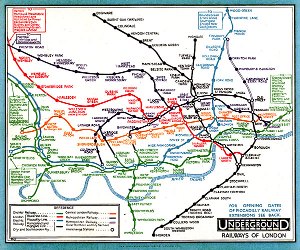 |
| Above: 1932 pseudo-geographical pocket map by F.H. Stingemore. |
|
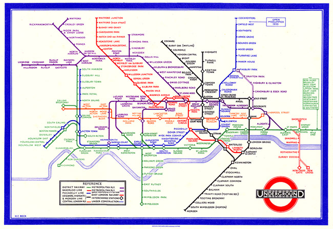
| Below: 1933 diagrammatic conversion by H.C. Beck. |
 |
| Information design has been around since man first used symbols and tried to explain himself to his fellow man. It’s nothing new. Beck had a champion in the much respected designer Ken Garland and Mr. Garland wrote of his friend’s work on more than one occasion. Stimulated by a growing interest in such things, his book ‘Mr Beck’s Underground Map’ appeared in 1994, and is well worth a read. |
| In his own small way Henry Beck’s work may have transformed passengers’ travelling habits with his extraordinary piece of information design. It has subsequently transformed history to (now) somewhere between truth and myth – ever moving closer to the latter. It has been said that ‘even God cannot change history, only historians can do that’. |
| It is unfortunate that Beck’s undoubted contribution to this corner of life has been distorted towards fable. Those who care about the truth are now (still in a small way) being confused by conflicting commentaries. I suppose I too am now contributing to this for the same reason – because I care about facts more than I do about legend. |
| More and more often we encounter articles in the press and snippets on the radio. We even get the odd 30-minute programme on the television – masquerading as education, even though we know that it is in reality just another dollop of entertainment. |
| Others have written more lucidly than I on what Henry Beck achieved and from where his ideas may have come. I feel little need to add to this here, but see the end of this article for references. However, what I would like to give an airing to is the name and work of George Dow. Who was George Dow I hear you thinking. Indeed. |
| George Dow designed and drew railway network diagrams. He straightened out the tangled geographical lines so that users could allow their eyes to flow effortlessly along each route on the map (something the present London Underground map designers are unable to achieve). |
| He drew many such diagrams at least four years before Henry Beck started his crusade and battles with the Underground company and later London Transport. Beck lived in East Finchley at the time (I am told) and it is more likely than not that he would have travelled on the local trains provided then by the London & North Eastern Railway (LNER). The LNER had displayed its information design solution in its carriages to help its passengers comprehend what was on offer. These diagrams were designed and drawn by George Dow. |
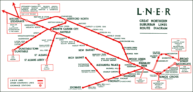 |
One of George Dow’s many diagrams that preceded Beck’s Underground version. This one dates from 1929 and was used inside the carriages that passed through East Finchley, where Henry Beck lived. |
By that time, the Underground map line colours had pretty much settled down to those with which we are familiar today; so too had the graphic devices of indicating where the stations occurred on each line and the style of naming them. Beck (we cannot of course be certain now, all these years later) must have been influenced by George Dow’s diagrams. Even if subconsciously (though I doubt it was) he must have absorbed what he saw. So Beck almost certainly applied Dow’s, and others’, design principles to the London map – and very successfully too if later acclaim is the unit of measure.
|
| But he didn’t invent any of the design principles or concepts. And while we are at it, can we kill off another myth about electrical circuit diagrams. Look at an electrical circuit diagram of the time and tell me what the presentation has in common with the first Underground diagram – then we can discuss all the features they do not have in common. |
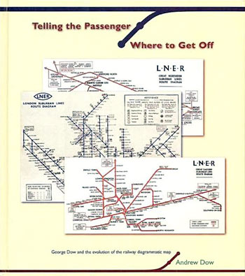
| Myth is now gaining momentum and I feel the need to offer a more reasoned commentary. I also commend anyone who has stayed with me so far to buy Telling the Passenger Where to Get off (which is what such maps actually do). This is a surprisingly controlled and dispassionate book by his son, Andrew Dow, telling the story of his father’s life and work. |
| This book makes some perceptive points that are long overdue in print and it is good to see some fundamentals explained as to what a particular map’s purpose is, rather than just getting bound up in what it looks like. It has the essential context missing from the writings of some others who are simply captivated by the subject. |
| There can be very few people who have never looked at a map, though up to the late 1980s the ability to draw one was confined to a much smaller number. A much smaller number still had (and still have) the truly innovative skills required to ‘design’ a map for a particular purpose, not previously tackled. George Dow was such a man and his contribution to the lot of the railway traveller has been almost completely neglected. |
| The London Underground diagram is possibly the world’s most famous railway ‘map’ and this is almost certainly because it portrays a confined single-city network – one that serves, some say, the most important city in the world. The London Transport brand is world famous and allegedly second only to Coca Cola in image profile. The Underground diagram has played a major part in this international renown. This is staggering for a public transport map. It also explains why the work of Henry Beck is so well-known today. What would the outcome have been had George Dow’s work been for a world famous railway operator in a major city? |
| Don’t overlook this book. It takes a more searching than usual look at the evolution of diagrammatic railway maps. It charts the career of a lesser-known individual who commenced work before Henry Beck and was, at the very least, the equal to him in terms of pioneering, creative output and productivity. I hope this book will elevate the name of George Dow to its rightful place in history. |
| Telling the Passenger Where to Get Off: George Dow and the Development of the Diagrammatic Railway Map by Andrew Dow; 2005, ISBN 185414-291-7. |
 |
Recommended sites to visit: |
www.metadyne.co.uk/UndMap.html
www.tubemapcentral.com
His name was Henry
|
| |
 |