 |
 |
This section is for readers who might be interested in book production and printing — these notes refer to the First Edition, though the same principles for print and binding apply to the Second. The whole subject is highly technical and printing in particular has no right to work at all. I have no idea why whoever thought of it even bothered to see if it would work. Of necessity I have greatly simplified much of what follows to (I hope) keep it engaging for those with a general interest.
When it comes down to it, it’s all a load of dots. Before reading any further, I suggest you go and get something that has been professionally printed (not output from your computer printer) in the form of a magazine or newspaper - or a copy of this book. You will also need a magnifying glass.
What I am about to describe is called offset-litho printing (short for lithography). |
 |
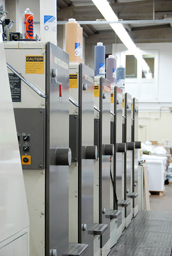
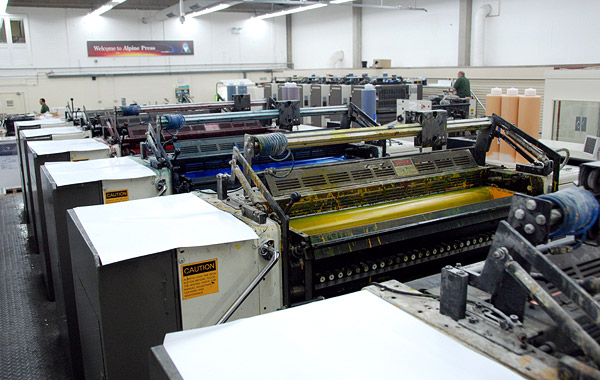
The machine the book pages was printed on cost well over a million pounds, can print six colours at a time as the paper passes through the press, and can run at up to 15,000 sheets an hour. It costs hundreds of pounds an hour to run and so every aspect is tailored to keeping machine time as short as possible. Each one of these vertical grey units prints one colour. The paper feeds in at the right-hand end of this picture and about 2000 sheets can be seen on the palette, having come out at the left.
|
| We first need to understand all these coloured dots and why they are needed. Keeping it simple, the vast majority of colour printing seen today is done using a method called 4-Colour Process. Four colour inks are printed, one after the other, as the paper passes through the press. 4-colour process is often referred to by the initials CMYK and this stands for the colours Cyan, Magenta, Yellow and blacK. If you have a newspaper to hand you might be able to find at least one page that has rows of either small coloured disks or blocks down one edge or down the centre fold. These are the four colours and the disks or blocks are for checking purposes. You will notice that some of the disks/blocks are lighter than full strength. |
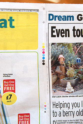 |
This is the spine of a double-page from The Daily Express. Near the top, two crosses can be seen and these are actually two sets of four crosses, one for each of the colours, and all on top of one another, showing that they fit (which is often not the case with newspapers). At the bottom of this photograph you can see the letters Y M C K. Between the crosses and letters you can see there are eight small disks; there is one pair for each colour and in each case one is solid (100%) and one as a 50% (probably) dot screen making it look like a lighter colour. (The 50% dots disks look darker than half colour but I cannot go into that here as newspaper printing brings with it a whole series of its own technicalities, mostly caused by the poor quality absorbent paper, the large quantities printed each day, and the high speed printing systems used.)
It is obvious when looking at any printed images (especially photographs) that we think we are looking at an almost infinite number of colours. In truth there are only four and the rest is all an illusion caused by the weakness of our eyes to see the individual dots. The dots are different sizes and the bigger the dot the more impact it has on what we see.
The dots are printed in a sort of grid and each of the four colours has its grid set at a different angle, to eliminate unwanted patterns forming. By varying the size of the dots, for each of the four colours, and printing them on top of one another, we see a huge range of colours. The dot density (relative size) can range from: the point where the dots are so big they fill in and make a solid image (full strength colour) to no dot at all (no colour). The size of the dots is measured in percentage terms and full strength (solid) is also known as 100 per cent. |
As such, 100 per cent black will give you solid black and a 50 per cent dot will give what looks like a mid grey. However, and this is critical to understanding the whole process, the individual dots are still full strength black - they are not grey. It is just the same as a chess board; up close you can easily see individual black and white squares (though printing dots are usually not square - advanced stuff I cannot go into here) but now look at it from a long way away and it will just look like one big grey square. The fineness of detail is improved the more (smaller) dots there are in a given space, known as dpi, or dots-per inch (not quite the same meaning as on your PC printer). Newspapers are often printed at no better than 85dpi (there is much more to it than that though); standard offset-litho printing is commonly 175dpi nowadays; my book was printed at 240dpi. Luckily we don’t have the eyesight of an owl or all this would not work. |
The next thing that needs to be understood is that, though the inks used are thicker than engine oil, they are in fact translucent (they allow light through). So, if we print solid cyan (a deep sky blue) at the same time as solid yellow, irrespective of which goes on first, we see green. Print magenta and yellow and we get bright red. No green ink is used and nor is any red. |
The great variation of visual colours is created by varying the percentage of dot relative to the blank white paper on which it is printed. A 50 per cent dot will visually halve the apparent strength of the colour, but almost any percentage can be printed (as long as you know what you are doing), though in truth it is unwise to go much below 10 per cent or above 90. |
I have explained that solid (100 per cent) cyan and solid yellow gives a mid-green. A lighter green can be created by combining 70 per cent cyan with solid yellow; 50 per cent of each gives a lighter, more pastel green; 30 per cent cyan and 70 per cent yellow will give a more yellow-biased (lime) green, and so on. Some colours can only be created using three colours (brown for example) and some require all four. The possibilities are vast, though it is not possible to print every colour imaginable; 4-colour process is more flexible than any other but in reality there is an infinite number of colours our eyes can recognise and actually most of them cannot be re-created using this process. Versatile it is, but it cannot do the impossible. |
At this point you might be wondering why the offset-litho printing press in the photographs has six units, enabling six colours to be printed in one go. I cannot go into this either as it will all get too complicated and is not relevant to how the book was printed. That said, five units were used. |
This book was always intended to be produced to the highest standard. I took 15 years writing, designing and producing it, and the page size I opted for was chosen to get the largest page size I could get on a press of this particular size. It is known as a B1 Press and takes a maximum sheet size of 1020x720mm. This enables 16 pages of the book to be printed on one sheet of paper - eight on each side of the sheet. Printing single leaves at a time would cost a fortune and cost a lot more to bind as well. |
Have you ever tried turning the page of a magazine or book and found that you couldn’t open it properly, because the next page was still partly joined to it? (I hope the answer is yes otherwise you might struggle with the next bit.) That’s because it wasn’t folded and/or trimmed accurately. |
The quantity of pages of a book that can be had from one sheet of paper depends on many factors (more advanced stuff I can’t go into). My book was was printed as described above ‘8-pages-to-view’ - also known as a ‘16-page set’ as it is printed on both sides of the paper. (See the explanation farther down about page impositions.) |
The book was produced using various software programmes and went through more test proofs than can be imagined, as I was so keen to ensure I got the colour rendition of the tile pattern drawings as close as possible to something real (you will need to read pages 55 and 56 of the book to find out more about this). |
| In recent years, book production and allied printing processes, like many others, have changed rapidly owing to computer developments. In short, my computer production files (dozens of gigabytes) were handed over to the printer for him to make the printing plates that then went on the press. The plate-making files are over ten times bigger. |
 |
 |
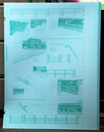
This picture is of one of the four plates for one side of one 16-page set. It is a black plate, though the colour comes from the ink on the machine and is not present on this, as yet, unused plate.
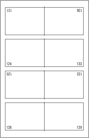
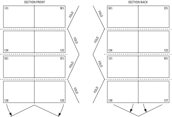
It might be a bit difficult to work out what you are looking at and I hope the diagram will help. Visually divide what you can see half-way up, left to right. Now do the same again with the top and bottom halves. You should now be able to identify a double-page spread in the bottom quarter and this is pages 128 and 129 and is of Belsize Park.
The plate is made from a zinc alloy and has the image applied to the surface photo-chemically. Where there is image, ink is attracted (and so printed); where there is no image, the offset-litho process repels the ink, leaving the paper white.
The plates cost about £40 each and the book required 140, plus those for the covers, varnish (see below), posters and boxes. |
| The following photographs are intended to show the sequence of events of a sheet of paper passing through the press. To get a real feel for it a video is needed. As noted above, this press can print 15,000 sheets of paper, one side, per hour. But before any of that can be considered, I need to explain ‘make-ready’. |
| After the plates have been made (and proof checked) they are fitted to the press. The picture above shows a flat sheet of thin metal and there are some fixing holes that can be seen on the left-hand edge. These enable the plates to each be bolted onto a cylinder (it’s important to put the right plate on the right cylinder, so that it receives the right colour ink of course). |
The first unit on this 6-colour press was not used on this job. For the first 8-page side to be printed, each of the four plates was bolted to its appropriate cylinder. A fifth plate (effectively with a complete image coverage of nothing) then went on the sixth cylinder unit, and this was used to ‘print’ a clear matt seal which went over all the ink. |
With all five plates in place a few dozen sheets of paper are then run through. Each of the plates is then adjusted to get the images to fit precisely. The ink density is also fine tuned. Just like spreading butter on a slice of bread, you can vary the thickness of the inks (though not a lot). The colour of the ink does not vary as it comes out of the tin and goes onto the rollers, though the thicker it is applied, the denser the colour. Remember, the inks are translucent. |
This make-ready process is a skilled job and, with modern computerized printing presses, can be done in about 20 minutes - ten years ago and it would take an hour. The press is run quite slowly during this stage and stopped frequently to test the results. When the ‘machine minder’ is happy that his test sheets (and there can be a few hundred before it’s spot on) match the proofs as well as is practical, the job can then be printed. The machine is then run up to speed. As only 1500 books were printed, it was not practical to run it at full speed and it was actually run at about 12,000 sheets an hour. Therefore, one side of one sheet of paper resulted in eight pages and took about 35 minutes in total. |
The book has 216 pages, made up of thirteen 16-page (eight pages on each side) sections and one 8-page section (at the front as it happens). If you have bought the book, have a look at the thread stitching and you will find the first after four pages - it’s in the middle of that 8-page section between pages iv and v. All subsequent sections are 16 pages, so the next thread-sown centre is between page xvi and 1, then 16 and 17, and so on every 16 pages. There’s more on binding farther down. |
After 15 years creating this book I was obviously anxious that it was printed to the highest standard. A high-quality paper, 170gsm Satimat Silk, was chosen several months before the book went to print and a dummy was made to check that it had the right feel for this particular book. As this make of paper is not in everyday demand at this size, and with the quantity required for the whole production, it meant that a batch was specially made for the job. There was a six-week lead time for this. |
I could have got the book printed overseas much cheaper but wanted to retain control over the whole process and therefore chose a company known to me and only a 45-minute drive from home. They were very accommodating and I oversaw most of the printing. |
| The first sheet went on press at 10am on 5th September 2007 and, three shifts later, I left their premises at 4:45am the following morning. Later that morning I went back to oversee the next phase. |
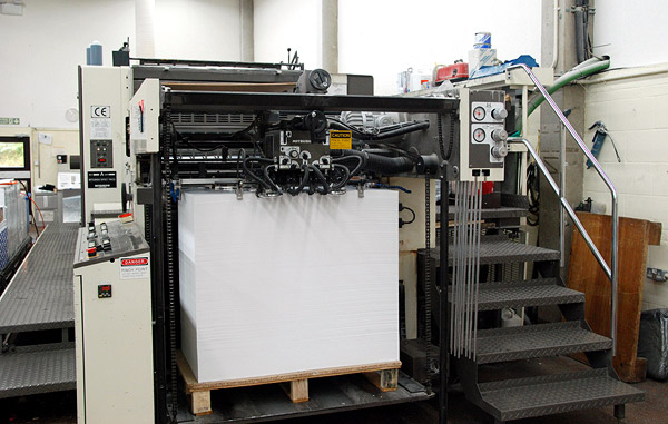 |
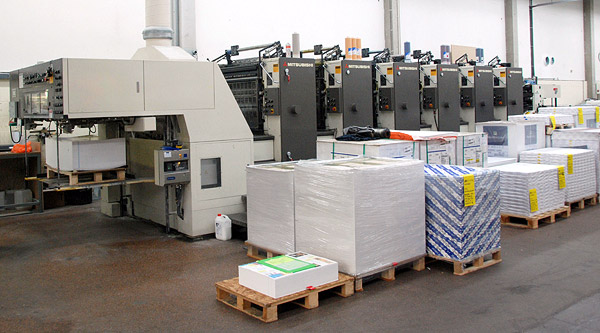
About 4000 sheets of paper can be seen on the palette, waiting to go through the press. The steps to the right lead up to the gantry that runs along the full length of the machine.
|
 |
This close-up (video needed) shows air being blown into the top few sheets to separate them. A series of vacuum suckers lifts the top sheet and feeds it forward (away from the camera).
|
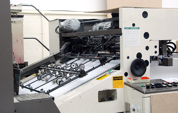 |
The suckers can be seen to the right of the picture, sideways on. A series of rollers receives the sheets of paper and moves them rapidly to the left, into the first unit of the press. Each unit prints its colour and projects the paper to the next unit. Though not a fixed procedure, this particular job was run in the sequence: black, magenta, cyan, yellow, seal.
|
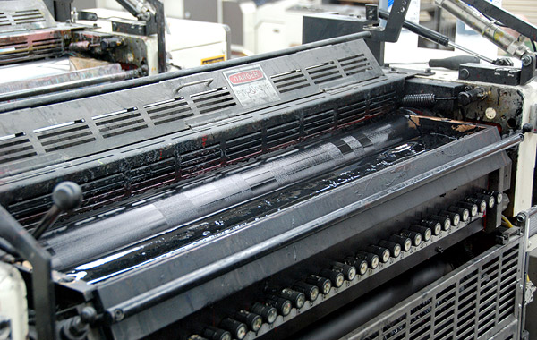 |
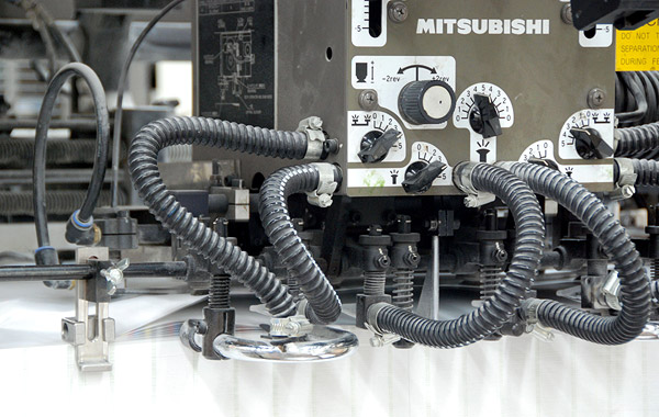
On goes the black. Note what look like a series of numbered knobs to the right. These are in fact 30 separately controllable channels on the ink duct across the long dimension of the plate. Each can be adjusted separately from the control desk at the end of the press (see farther down).
|
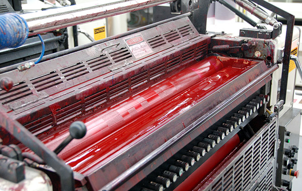 |
Magenta
|
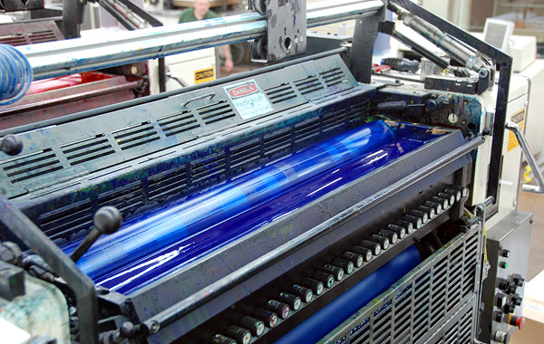 |
Cyan
|
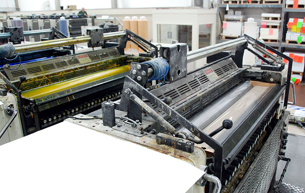 |
Then the yellow and finally the clear matt seal.
|
 |
Looking back along the paper path from up on the gantry.
|
 |
This is one 16-page section of the book. It has been printed on one side and the sheets land on a wooden palette. Immediately below the three glass inspection windows can be seen the ink duct numbers, from 1 to 30. The chain mechanism gradually lowers the palette as more and more sheets arrive.
|
 |
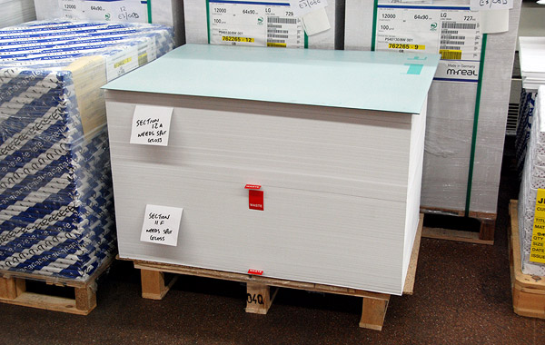
The small red tickets separate two sections. At the bottom of the stack is the left-overs from the make-ready of one section. Two more tickets can be seen higher up and these separate the make-ready of the next section and, a little higher, the run itself of that section. The two sections are then removed on a fork-lift, a new palette is then positioned and the chain raised ready for the next run. |
 |
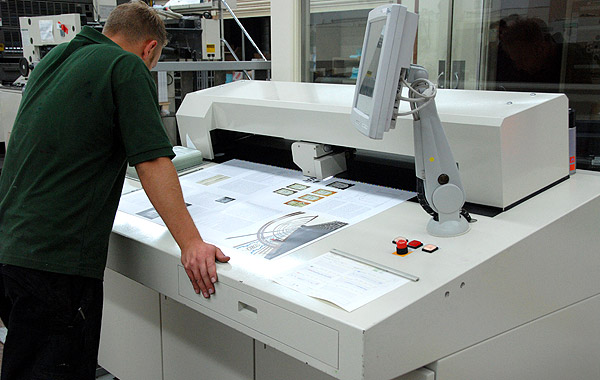
Having turned through 90 degrees the camera shows the view beyond the delivery palettes. This is the control desk and 30 electronic sliders, one for each channel, can be seen near the front. Other controls are to the right, below the monitor. The machine minder can select any of the colours individually and then adjust the ink flow on any of the 30 channels for that colour.
|
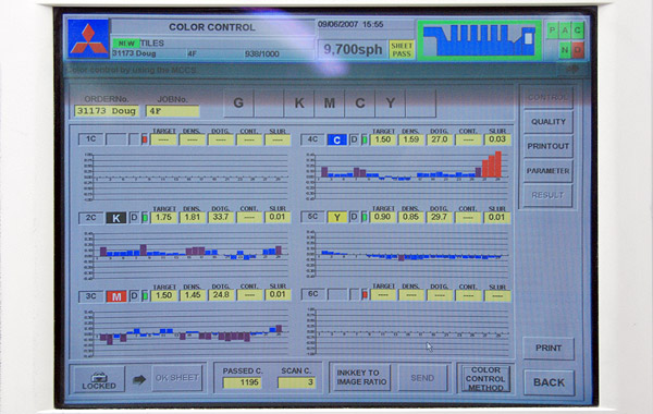 |
This is a close-up of the monitor on the control desk. The references can be seen for the six units of the press. Top-left is ‘1C’ (not in use). Below it is ‘2C’ ‘K’, for the black. Then ‘3C’ ‘M’ for magenta and so on top right downward. From left to right on each of the six histograms is one small coloured block for each of the 30 channels. The coloured blocks indicate the ink flow either above or below the horizontal line showing over- or under-inking. Blue is close to perfect and purple is still well within tolerance. Red tells the minder that the ink flow might need adjusting, as can be seen top-right, to the right of the sheet for the Cyan ink. In reality, this may be quite all right too, depending on the image density at that part of the image on the sheet and other factors. The skill of the machine minder is paramount. This equipment is his guide and not his master.
|
 |
Elsewhere in the works is a very expensive scanning device. Along one edge of the paper is the row of colour control blocks referred to near the beginning of the piece. A light traverses, left to right, above these blocks, measuring the density of the blocks. A sheet is pulled from the run every few hundred copies for testing, to ensure that the correct colour density is being maintained, or to find out if adjustment might be required. Like a small child, a print run needs watching all the time.
|
The machine minder also takes an electronic recording which is kept indefinitely. Though the printing plates are all re-cycled nowadays, should more copies be required at any time in the future, the exact settings, for every colour, for every sheet, can be programmed back onto the press. Theoretically, a reprint years later should look the same as previous editions, even though it is from new plates. |
There is more to this printing story though. I have explained about the four colours and the machine seal, as it is correctly called, but I wanted to go one stage farther. |
The tile patterns central to this research project, and the book, were almost all finished with a high gloss glaze. At three stations though, some matt glazed tiles were used. (I again refer readers to pages 55 and 56 of the book.) In order to try and show this in the book, I decided to spend the money on yet more plates at £40 each and add a gloss varnish, in the right places only, on top of the tile pattern realization drawings. These occur on pages 60 to 155. This brought with it other technical difficulties. How for example do you get an exact fit of clear varnish to a coloured drawing. The printer said it was not a problem and indeed it wasn’t. One problem did occur though and it turned out to be a stinker. |
The six-colour press ought to be able to deal with this. The first four units would take the four colours, then the fifth would have the machine seal, and the sixth the gloss varnish. In practice there was too much cross-contamination of colours, seal and varnish and, at their own expense (and very much to their credit, also wanting a high-quality job) this sequence was abandoned. |
| Having printed two sheets and both coming out just a shade too dark, unrectifiably, a different approach was taken. Instead of the economy of running the sheets through once with all six units functioning, the job was run, not using the first unit and only with the four colours and seal in one run (or ‘pass’ as it is called). The whole book was printed this way. Leaving the sheets to stand for a few hours, the machine was washed up and only the sixth unit used this time, to run the gloss varnish, putting the relevant sheets through a second time. They all fitted. I hope it was worth it. |
 |
This picture shows a palette with two sections having been printed. The notes say ‘needs spot gloss’ (because not all of them did). Resting on the top is one of the plates for the gloss varnish. There is only one page out of this particular eight-page section that needed the varnish (page 153 as it happens).
|
| So that’s an overview of how the book was printed. Though the pages were all printed in two days, the whole job took about two months, but other aspects had to be completed before any of the above even started. |
The Manufacturing Sequence: |
| The end product comprises several elements. There is a set of four folded sheets, each measuring 1200x960mm and these are housed in an inner box with a polystyrene spacer; there is the book itself; there is an outer slip case (an even more sturdy protective box). For all the components to fit, they had to be printed and assembled in the right sequence. This was: |
- print the four large single-sided sheets (different print works with a larger press)
- fold the sheets and deliver to the second printer (details as above)
- print the book (14 double-sided sheets)
- fold and trim the 14 sheets (see below)
- stitch book pages
- print the inner box
- gloss laminate, fold and glue to make the inner boxes
- insert one set of four large sheets and polystyrene into inner boxes
- print book cover sheet
- gloss laminate and glue book cover sheet onto hard covers
- assemble pages and affix into hard covers
- make dummy slip case to establish precise size required
- produce artwork to fit and print sheet for slip case
- make slip cases and glue on gloss laminated printed cover sheets
- insert one book and one inner box of large sheets into slip cases
- shrink wrap complete product
|
After much experimentation I designed a book with pages measuring 300x240mm landscape (portrait is the term used for pages that are tall rather than wide). Under normal circumstances, landscape books are not a good idea for several reasons, the most obvious ones being that the pages become very floppy and also put much more strain on the binding. However, my drawings needed as much width as possible, so landscape it had to be. I could have gone a little bigger but then it would have been difficult to fit on most book shelves. Shame. |
As noted above on cost grounds, the less time on press the better. Most books are printed in 16-page sets (gross over-simplification, but it will do) and B1 presses are the most economic to use for this sort of size book, so I worked on the most sensible page size for which I could get a 16-page set out of one sheet of paper. The sheet size must be a bit bigger overall to allow for colour registration, bleed, folding and trimming, more of which below. This decision was taken back in 1994, with publication not even really considered at that time - but just in case. Five computer upgrades later and it actually happened. |
Having decided on the page size, the first job was to print the four large-format sheets. The drawings were scaled as appropriate and a layout calculated that allowed one complete platform to be portrayed on a sheet size that would then fold to 300x240mm. This was 1200x960mm and too big for a B1 press. Larger presses cost disproportionately more money than B1, the demand for them is lower, and so also there are not that many around. |
My chosen printer therefore started the ball rolling and printed the four sheets. Make-ready takes longer on a larger press and running 1500 copies of four single-sided sheets took the best part of a full day shift. Again I oversaw this at their works. They then folded them, on another impossible machine, and delivered them to the book printer who could do little until they received the sheets. Just to add to the process, 300x240mm is not a standard size and so cardboard boxes are not available in which to pack and deliver them. The folded sheets were shrink wrapped to keep the weather out and delivered on wooden palettes. |
| By this time I had designed and produced artwork for the inner box, the hardbound book cover and the outer slip case, though I could not finalize any of them as I needed measurements accurate to less than 0.5mm to ensure the designs fitted exactly. A further issue was that I wanted the title on the inner box to look the same as that on the book’s spine. The ‘spine’ of the inner box would therefore need to be the same width as that of the book. |
But I would not know the width of the book spine until several other stages had passed. First we had to print the book, fold and trim it (see below), print the covers, glue the covers onto the board covers, stitch the book and fix it into the covers. The spine ended up 27mm wide as it transpired. Now we could make the inner boxes with a short dimension to match. |
The material for this inner box was the thickest that would go through the press: 590-micron folding box board. (The production details in the book state 500-micron, but the book had already been printed before the late decision was taken to increase the thickness of the inner box, at slightly greater expense.) The artwork was thus adjusted and printed directly onto the box board and this subsequently gloss laminated on the outside. |
 |
The inner box was designed to make things easier during the assembly process; being symmetrical, either spine could face outward and act as the front title panel. I specified this as it had another advantage - the tuck-ins made the title panels double thickness, giving additional rigidity to the structure.
Taking the thickness of the box-board into account, the large side faces were calculated to leave just sufficient room inside to accommodate the four large folded sheets. They should not be loose, which could cause them to move about and possibly become damaged, whilst the box should also not be too tight so as to stop the sheets going in and out easily.
The book spine was 27mm wide and I wanted the box to be the same. However, this would make the inside too generous and so a sheet of 12mm thick polystyrene was an after-thought (additional to budget again) to take up the slack. |
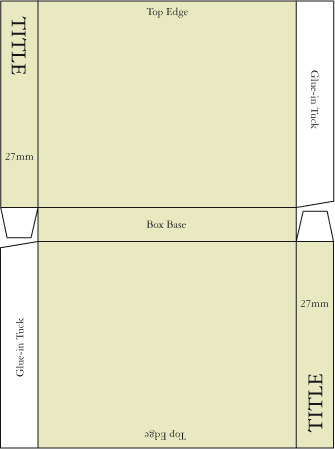
| After the inner boxes were printed they were then gloss laminated, die-cut, as per the diagram above, creased, folded and glued, to make boxes with an open top. |
| While this was in progress, the book sheets were being bound (no covers yet). Ignoring the single 8-page set for now, below is what happens to a 16-page set. As can be seen, the page numbers look a little odd and half of them are upside down. |
Each sheet is folded like a concertina (see diagram below) along the dotted lines. It is then folded in half, between the page number pairs. The pressure from the folding machine on the creases is immense, so, before this the paper is perforated along the dotted lines, to allow the air to escape. After this, the paper is trimmed with a guillotine, exerting further immense pressure onto the cutting edge, on three sides. The side with the centre fold is of course not trimmed, as this becomes the spine where the stitching takes place next. |
You can try this with an ordinary sheet of paper. If you fold and trim it correctly you should end up with a miniature 16-page set of four individual wide sheets of paper. Page 121 will be at the beginning and you should end up with page 136; pages 128 and 129 will be the centre double-page spread. |
 |
The next stage was to fine tune the artwork for the cover of the book itself. The design needed a spine 27mm wide but also had to take account of the size of the hard covers being 3mm wider than the pages, and also 3mm oversize top and bottom. In other words, with a page size of 300x240mm, the hard covers (known as case-bound) would actually need to be 306x243mm, plus the thickness of the spine and binding, making it 306x246mm overall. |
Before going into the outer cover paper being printed, I first need to explain the book binding process. |
The assembly of fitting the pages into board covers is a lengthy process in itself and had to be done by a specialist book-binding company. Each of the fourteen sheets of paper has to be folded, stitched and trimmed, as per the diagram and description above. The particular binding I wanted is called ‘saddle stitch thread sown’. (Other forms of saddle stitch are commonplace and, what is frequently thought of as stapling is actually just another type of saddle stitch binding known as ‘saddle stitch two wires’, for two staples, ‘three wires’, for three, and so on.) Staples are inappropriate for case binding and cheap ones often rust. |
| When all the folding, trimming and stitching was complete, the result was still fourteen 16-page sets and the case-binding process is what brings them all together, side-by-side, and the board covers are affixed. The board covers however also need to have their outer design printed and glued on and this has to be done before the internal pages come together with them. |
If you look at any case-bound book, you should find that the inside of the covers each has a different sort of paper glued to it. This paper is thicker and extends beyond the inner spine and is glued onto the left-hand end of the first page of the book. The same occurs inside the back cover. These are known as ‘end papers’. End papers can be any colour and sometimes publishers use a bright colour; they are not printed, the colour is part of the paper when it is manufactured. I chose a light cream end paper because there is a lot of colour in the book and so I wanted quiet end papers. |
Have another look at the end papers and, as well as seeing them glued to the first and last pages of the book, they also obviously cover the whole of the inside of the board covers. The outside of the board covers has a printed sheet of paper with the cover design on it glued across the whole of the front cover, spine and back cover. Crucially, it also wraps around the edges of the board covers by about 15mm. The end papers then glue over the top of that. |
Back to the case-bound covers then. Above I referred in passing to ‘bleed’. It is not possible to print an image right up to the edge of a sheet of paper or board. The printing must extend beyond the finished size (3mm minimum and 5mm is safer). The paper, when later trimmed, is therefore guaranteed to have an image that reaches the edge of the paper. This excess of image is called ‘bleed’. All the pages in the book had it too, for the same reason. |
The design of the outer book cover was now known to need a spine 27mm wide and the back and front cover images were made to take into account the 306x246mm, and then had an additional 15mm to allow for the binding process. This was straightforward, but see farther on about the same exercise for the slip case. |
The outer cover sheets were then printed ‘three-up’ on a sheet of paper. Three-up means that three identical covers would be printed on one sheet of paper, one above the other, and then trimmed to separate them. The requirement was for 1500 copies and this meant that only 500 sheets would need to be printed (but see below about waste). |
The cover sheets were printed and gloss laminated. This gives the covers a high gloss finish and also adds to the strength of the covers. At this point the book components were all in place and could be assembled to make finished books. |
I wanted the book and inner box to slide in and out of the outer slip case easily, but crucially not to be loose. With the inner boxes also complete, we could now make a reliable dummy slip case to establish exactly what the right dimensions would be. This is where it got very complicated. |
| When on a bookshelf, the slip case’s front opening would reveal the spine of the book and the equivalent aspect of the inner box, side-by-side. Some people, myself included, prefer to keep such books on their shelves with the book spine at the back of the bookcase. This helps keep dust out, but you end up seeing the back of the slip case and not the book. I therefore decided that the short side of the slip case opposite the book spine should have a cover design printed that looked like the book and inner box, with the thickness of the slip case board surrounding them. |
The slip case design would also mimic the back and front covers of the book. Taking into account the thickness of the slip case itself, this made calculating the artwork, as a flat sheet of paper, very complex. It was made more complex by the thickness of the slip case boards being double on the top and bottom, caused by its own particular construction. |
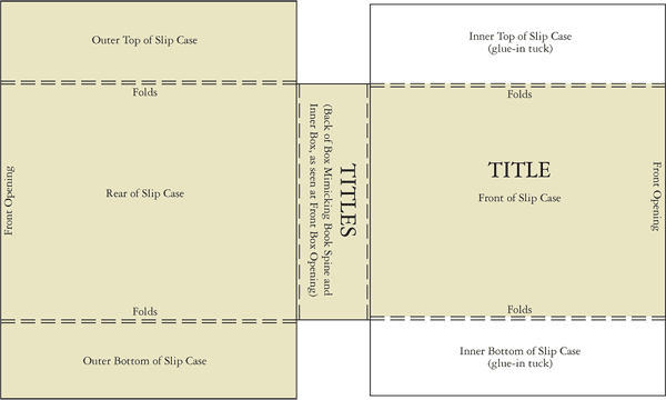 |
This diagram shows the complex shape that had to be die-cut. It also shows the slight offset of the folds needed in order to create the double thickness of the slip case top and bottom.
|
With the design created, it was printed out on a large format colour ink-jet printer to test. This sheet too would need 15mm of bleed where it wrapped inside the slip case, and another 2mm in places, to take into account the thickness of the board. |
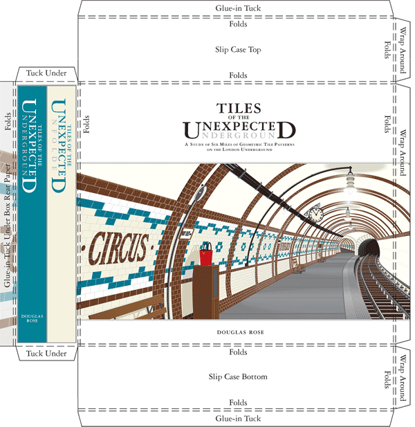 |
The illustration above shows the way the outer slip case cover paper had to be die-cut, wrapped around the board box and glued. This sheet formed the front, top, bottom and spine of the box. |
A second, much simpler sheet, (below) was required for the rear of the slip case, though it had to be very carefully glued in place, for the image to line up with the front, so that the whole image appeared to wrap around the box. |
 |
The final print job was therefore for the slip case cover sheets - two pieces of paper where one glued over the top of the other at the corners, and this too had to have the design fitting. These were then gloss laminated as well and glued to the outer slip case. |
| Finally, there was the task of inserting one book and one inner box into each slip case. They were then shrink wrapped ready for delivery. |
A Few Statistics: |
I have said that 1500 books were printed but this is not quite the whole story. At every stage along the way, more copies are required than will be delivered at the end. The make-ready process obviously uses up about 100 sheets and these are re-used on the back for another make ready. There were 14 sections to go through this and the printer actually ran about 1900 copies of everything. |
Next up is the folding stage and this too has make-ready, to get the machine folding absolutely exactly in place. More sheets are wasted. Trimming loses some more and so does the stitching. More disappear at the binding stage. Overall, it is normal on a job of this complexity to waste anything between 30 and 40 per cent of the original supply of paper. It is of course all re-cycled and comes back as a lower grade of paper. This on-going waste re-cycling eventually cascades an original high-quality paper, down the grades to the very bottom - not ‘newsprint’ (used for newspapers) I am told, but brown wrapping paper, otherwise known as Craft Paper. |
As noted elsewhere, several commercial publishers wanted this book but all pulled out on financial grounds. The launch of this website in 2004 has caused many interested people to contact me and one of them, DMC Contracts (www.dmccontracts.co.uk) showed so much interest that they most generously sponsored a substantial amount of the print cost. Further interest from London Underground’s (www.tfl.gov.uk) Managing Director, Tim O’Toole, also contributed a large slice, and the London Transport Museum (www.ltmuseum.co.uk) gave me a guaranteed order. |
| The book trade usually works on a rate of the cover price being about five times cost. The shops require at least a 35 per cent discount from the distributor and the distributor gets his slice from the publisher, who in turn has to pay for the printing, storage, deliveries and all the accountancy baggage that comes with it. The publisher also usually pays the author, book designer and production people. |
Using this model, a book costing £50 would need to be printed at a unit cost of no more than £10. The printing and manufacturing costs for my book have pushed right up against £40,000 for 1500 copies, or about £26.50 each. At this rate, the cover price would arrive at about £130 and canvassing opinion as to what the price actually ought to be was an interesting exercise in itself. The answers I got (many from people in the book trade) ranged between £25 and £200. I could have increased the print run, which would have reduced the unit cost a bit, but this would also increase the financial outlay (that I didn’t have) and increase the risk of having too many left over unsold. |
| As readers have probably gleaned by now, I haven’t produced and published this book in order to make money. There was no point in even considering it. The sale of the whole print run will make it just about break even, but after all these years, and moral support from major institutions like English Heritage, LT Museum, Museum of London, Guildhall Library, The Jackfield Tile Museum (and others), it just had to be done. |
| |
| Go to next section >> |