| |
|
|
| |
| |
ALL TEXT AND IMAGES ON THIS SITE ARE SUBJECT TO COPYRIGHT. |
| See Contact Me page for details. |
| |
| This is the website of Doug Rose. It has been designed by me and is built and maintained by my good friend Jamil Shehadeh. The animations on this site have been created by my good friends Clive Truby and Kevin Baverstock. |
| Site last updated 21st March 2026. |
 |
| I am fascinated by human reasoning of graphic information in all its manifestations: forms, maps, signs, instructions, book layouts, all of it. I am just as interested in the logic (or commonly the lack of it) of the designers who create this material that is everywhere in our lives, as I am in the way the users then try to make sense of it. So often people blame themselves as ‘being no good at understanding instructions’, when actually it was the instructions that were poor and not their interpretation of them. |
| When I was about twelve years old my mother wondered why I was spending hours on the floor faithfully copying pages of the London A-Z onto a sheet of cartridge paper, in pencil, by eye. Why indeed? Well it was something to do. Following a visit to London Zoo, I broadened my horizons and moved up to coloured pencils, and copied the zoo map. I then went diagrammatic and drew my own London Underground map. |
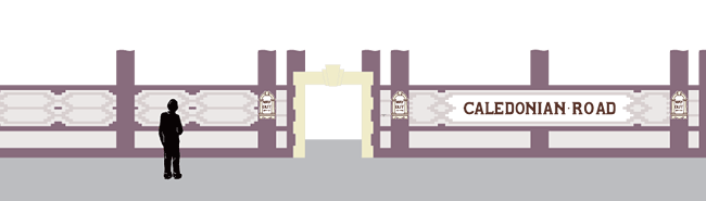
| I left school at 16 (couldn’t get away soon enough) and trained as a cartographer; this rapidly led to an interest in typography, signage, information design and printing. This in turn made me aware, and later in awe, of London Transport’s ‘Johnston’ typeface that I had been looking at during my formative years, not realizing why it existed, nor why it did its job so astonishingly well. How could a typeface look so simple and work so very well? Answer: it is not simple - because Edward Johnston worked so hard and did such a terrific job of fooling us into making it look simple. |
I have based my professional career on my appreciation of these solid principles of clarity and unambiguity. Someone said to me a few years ago that an awful lot of effort goes into making something look effortless.
Very much as a tribute to the great man’s work, the page buttons to the various sections in this website utilize a slightly condensed interpretation of his typeface, designed by myself a while ago. A complete family of types is in preparation and one day I might even finish it.
|
 |
| |
| Go to next section >> |